Control Group
Group control is a control used to group two or more other controls.
It modifies the UI to be more intuitive and clear for the end user.
This control itself does not return any value. Its primary function is to omit rendering the divider between controls within the group, visually indicating that these controls are interrelated
For group control, the id property has no effect and is used only to separate groups by names. Read more
As an example, we have some alert component that offer two options:
- Display close button ( switch control )
- Delay ( slider control )
These options are related. If the Display close button option is enabled, then we should specify the Delay after which the close button will be rendered.
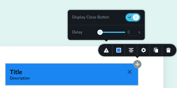
UI examples
How these usually look:
How they look with group control:
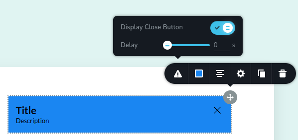
What's the difference:
The difference between the first and second example lies in the presence of a divider. In the first example, a divider separates the options. In the second example (using group control), the divider is omitted.
Code example
In this example, we implemented the group control with two other options that were described above.
const getToolbarItems = ({ getValue }) => {
  const closeButtonState = getValue("closeButtonState");

  return [
    {
      id: "toolbarShowHideButton",
      type: "popover",
      config: {
        icon: "nc-alert",
        title: "Alert"
      },
      position: 60,
      options: [
        {
          id: "groupCloseButton",
          type: "group",
          devices: "desktop",
          options: [
            {
              id: "closeButtonState",
              type: "switch",
              label: "Display Close Button"
            },
            {
              id: "delay",
              label: "Delay",
              type: "slider",
              disabled: closeButtonState === "off",
              config: {
                min: 0,
                max: 10,
                units: [{ title: "s", value: "s" }]
              }
            }
          ]
        }
      ]
    }
  ]
}