Control Tabs
The tabs control is an element within tabbed navigation interfaces. It serves as an interactive tab, enabling users to toggle between various content areas with various controls.
For tabs control, the id serves as the key name to store the current active tab, only if config.saveTab is provided and its value is true.
Read more
UI example
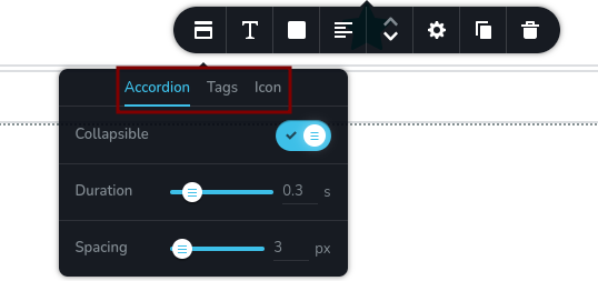
How tabs looks:
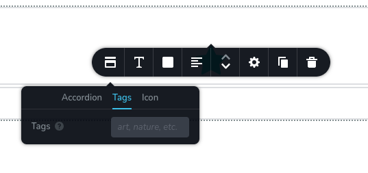
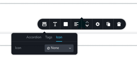
Switching between tabs:
Code example
The following example demonstrates a tabs control with two tabs: "Options" and "Settings". The "Options" tab contains three additional controls: three switches (Muted, Autoplay, Lazy Load). Similarly, the "Settings" tab includes two sliders (Width, Height).
const getToolbarItems = ({ getValue }) => {
  const isNotMuted = getValue("mute") === "off";

  return [
    {
      id: "toolbarAudio",
      type: "popover",
      config: {
        icon: "nc-audio",
        title: "Audio"
      },
      options: [
        {
          id: "tabsAudioControls",
          type: "tabs",
          tabs: [
            {
              id: "tabOptions",
              label: "Options",
              options: [
                {
                  id: "mute",
                  type: "switch",
                  label: "Muted"
                },
                {
                  id: "autoplay",
                  type: "switch",
                  label: "Autoplay",
                  disabled: isNotMuted
                },
                {
                  id: "lazyLoad",
                  type: "switch",
                  label: "Lazy load"
                }
              ]
            },
            {
              id: "tabSettings",
              label: "Settings",
              options: [
                {
                  id: "width",
                  type: "slider",
                  label: "Width",
                  config: {
                    units: [
                      { title: "px", value: "px" },
                      { title: "%", value: "%" }
                    ]
                  }
                },
                {
                  id: "height",
                  type: "slider",
                  label: "Height",
                  config: {
                    units: [
                      { title: "px", value: "px" },
                      { title: "%", value: "%" }
                    ]
                  }
                }
              ]
            }
          ]
        }
      ]
    }
  ]
}