控制選項卡
tabs 控制元件是一個用於標籤式導航介面的元素。它作為一個互動式選項卡,使用戶能夠在不同的內容區域之間切換,這些區域包含各種控制元件。
對於 tabs 控制元件,id 作為鍵名來存儲當前活動的選項卡,僅當 config.saveTab 被提供且其值為 true 時才有效。了解更多
UI 示例
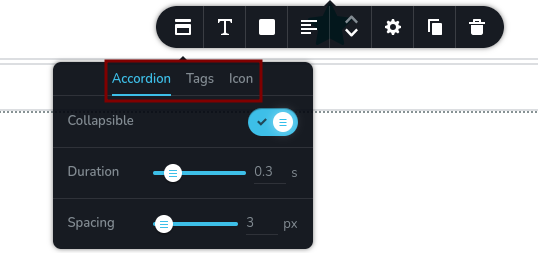
tabs 的外觀:
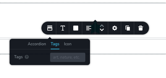
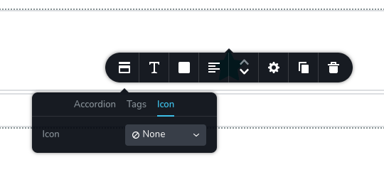
在選項卡之間切換:
代碼示例
以下示例展示了一個 tabs 控制元件,包含兩個選項卡:“Options”(選項)和“Settings”(設定)。 "Options" 選項卡包含三個額外的控制元件:三個開關(靜音、自動播放、延遲加載)。同樣,“Settings”選項卡包含兩個滑桿(寬度、高度)。
const getToolbarItems = ({ getValue }) => {
  const isNotMuted = getValue("mute") === "off";

  return [
    {
      id: "toolbarAudio",
      type: "popover",
      config: {
        icon: "nc-audio",
        title: "Audio",
      },
      options: [
        {
          id: "tabsAudioControls",
          type: "tabs",
          tabs: [
            {
              id: "tabOptions",
              label: "Options",
              options: [
                {
                  id: "mute",
                  type: "switch",
                  label: "Muted",
                },
                {
                  id: "autoplay",
                  type: "switch",
                  label: "Autoplay",
                  disabled: isNotMuted,
                },
                {
                  id: "lazyLoad",
                  type: "switch",
                  label: "Lazy load",
                },
              ],
            },
            {
              id: "tabSettings",
              label: "Settings",
              options: [
                {
                  id: "width",
                  type: "slider",
                  label: "Width",
                  config: {
                    units: [
                      { title: "px", value: "px" },
                      { title: "%", value: "%" },
                    ],
                  },
                },
                {
                  id: "height",
                  type: "slider",
                  label: "Height",
                  config: {
                    units: [
                      { title: "px", value: "px" },
                      { title: "%", value: "%" },
                    ],
                  },
                },
              ],
            },
          ],
        },
      ],
    },
  ];
};