標籤
Brizy 中的 tabs 控制元件是一種使用者介面元素,允許將多個內容區塊放置在單一視窗中,方便在它們之間進行切換。
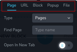
tabs 的 top 位置範例:
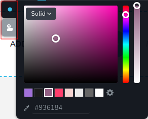
tabs 的 left 位置範例:
參數
| 名稱 | 類型 | 預設值 | 描述 |
| :------------------- | :--------------------------------------- | :--------: | :------------------------------------------------------------------------------------------------------------------------------------------------------------------------------------------------------------------------------------------------------------------------------------------------------------------------------------------------------------------------------------------------------------------------------------------------------------------------------------------------------------------------------------------------------------------------------------------------------------------------------------------------------------------------------------------------------------------------------------------------------------------------------------------------------------------------------------------------------------------------------------------------------------------------------------------------------------------------------------------------------------------------------------------------------------------------------------------------------------------------------------------------------- | ------------ |
| id | string | - | tabs 儲存資料的鍵的識別碼。 |
| type | string | - | 類型應為 "tabs" 以使用此控制元件。 |
| roles? | Array<Role> | - | 只有當當前使用者的角色符合提供的陣列中的其中一個角色時,才渲染該控制元件。
type Role = "admin" \| "viewer" \| "editor" \| "designer" \| "manager" | string** |
| tabs | Array<TabItem> | [ ] | 定義內容旁邊的標籤的陣列。每個標籤由一個物件表示。
TabItem: { id: string; className?: string; title?: string; label?: string; position?: number; options?: ControlItems[]; }
id - 每個標籤的唯一識別碼。
className - 允許您通過應用自定義樣式來自定義標籤項目的外觀。
title - 顯示在標籤上的標題,表示與該標籤相關聯的內容區塊。
label - 標籤的附加標籤或描述,提供有關其所代表內容區塊的進一步上下文或信息。
position - 指定標籤的位置。
options - 一組控制物件的陣列,表示與每個標籤相關聯的內容。
ControlItem: { id: string; type: string; className?: string; title?: string; label?: string; position?: number; }
id - 該屬性唯一標識每個控制項,並從已保存的選項值中派生。它代表與特定配置或選擇的選項相關聯的識別碼。
className - 允許通過自定義樣式來自定義控制項的外觀的 CSS 類名。
title - 顯示在控制項上的標題,表示與該 TabItems 相關聯的內容區塊。
label - 控制項的附加標籤或描述,提供有關其所代表內容區塊的進一步上下文或信息。
position - 指定控制項在 TabItems 中的位置。
type - 控制項的類型。 |
| position? | number | - | 工具列中控制項的位置。 |
| devices? | "all" | "desktop" | "responsive" | "all" | 定義控制項將在哪些設備上呈現。 "all" 在所有設備上呈現控制項。 "desktop" 僅在桌面設備上呈現控制項。 "responsive" 在平板和移動設備上呈現控制項。 |
| disabled? | boolean | false | 配置控制項禁用或啟用的條件。 |
| config?.showSingle | boolean | false | 如果只有一個標籤,則顯示標籤。 |
| config?.saveTab | boolean | false | 關閉工具列時,保存當前活動的標籤,確保重新打開工具列時它保持不變。 |
| config?.position | "top" | "left" | "top" | 元素相對於容器的空間位置或放置方式。 |
| config?.align | "start" | "center" | "end" | "center" | 指定標籤在標籤內的定位。 |
| default? | Default | - | 控制項的預設值。
Default: { value: string; }
value - 控制項的自定義初始值
|
| style? | function | - | 該函數基於控制項的值生成 CSS 輸出。參數是一個包含 value 鍵的物件,該鍵保存控制項的當前值。函數返回一個包含 CSS 選擇器鍵和 CSS 屬性值的物件。
|style: ({value}) => {
return {
"{{WRAPPER}} .brz-text": {
display: value === "tabExternal" ? "flex" : "none"
}
};};
基本範例
僅包含必要鍵的標準定義。此控制項將在所有設備上顯示。
{
  id: "actionTabs",
  type: "tabs",
  tabs: [
    {
      id: "upload",
      label: "檔案",
      options: [
        {
          id: "linkUpload",
          label: "檔案",
          type: "fileUpload"
        }
      ]
    },
    {
      id: "action",
      label: "操作",
      options: [
        {
          id: "actionClosePopup",
          label: "關閉彈出視窗",
          type: "switch"
        }
      ]
    }
  ]
}
返回值
僅當 config.saveTab 設置為 true 時,返回表示所選 tab 的 string。
{
  value: string;
}
值的範例:
{
  value: "action";
}
使用範例
角色範例
僅顯示給擁有 admin 和 designer 權限的使用者。
{
  id: "actionTabs",
  type: "tabs",
  roles: ["admin", "designer"]
}
設備範例
將在所有設備上渲染。這個值可以省略,因為預設為 "all"。
{
  id: "actionTabs",
  type: "tabs",
  devices: "all",
  tabs: [
    {
      id: "upload",
      label: "檔案",
      options: [
        {
          id: "linkUpload",
          label: "檔案",
          type: "fileUpload"
        }
      ]
    },
    {
      id: "action",
      label: "操作",
      options: [
        {
          id: "actionClosePopup",
          label: "關閉彈出視窗",
          type: "switch"
        }
      ]
    }
  ]
}
僅在 desktop 上渲染。
{
  id: "actionTabs",
  type: "tabs",
  devices: "desktop",
  tabs: [
    {
      id: "upload",
      label: "檔案",
      options: [
        {
          id: "linkUpload",
          label: "檔案",
          type: "fileUpload"
        }
      ]
    },
    {
      id: "action",
      label: "操作",
      options: [
        {
          id: "actionClosePopup",
          label: "關閉彈出視窗",
          type: "switch"
        }
      ]
    }
  ]
}
顯示限制在響應模式下,具體為 tablet 和 mobile。
{
  id: "actionTabs",
  type: "tabs",
  devices: "responsive",
  tabs: [
    {
      id: "upload",
      label: "檔案",
      options: [
        {
          id: "linkUpload",
          label: "檔案",
          type: "fileUpload"
        }
      ]
    },
    {
      id: "action",
      label: "操作",
      options: [
        {
          id: "actionClosePopup",
          label: "關閉彈出視窗",
          type: "switch"
        }
      ]
    }
  ]
}
禁用範例
控制項將被禁用。通常,這裡應該是您的動態條件。
{
  id: "actionTabs",
  type: "tabs",
  disabled: true,
  tabs: [
    {
      id: "upload",
      label: "檔案",
      options: [
        {
          id: "linkUpload",
          label: "檔案",
          type: "fileUpload"
        }
      ]
    },
    {
      id: "action",
      label: "操作",
      options: [
        {
          id: "actionClosePopup",
          label: "關閉彈出視窗",
          type: "switch"
        }
      ]
    }
  ]
}
當 videoType 變數為 "custom" 時,控制項將被禁用。
getValue 是一個 getter 函數,允許我們通過其 id 獲取控制項的值。
"videoType" 是下面 "select" 控制項的 id。
const getToolbarContols = ({ getValue }) => {
  const videoType = getValue("videoType");

  return [
    {
      id: "videoType",
      type: "select",
      choices: [
        { title: "Youtube", value: "youtube" },
        { title: "Custom", value: "custom" },
      ],
    },
    {
      id: "actionTabs",
      type: "tabs",
      disabled: videoType === "custom",
      tabs: [
        {
          id: "upload",
          label: "檔案",
          options: [
            {
              id: "linkUpload",
              label: "檔案",
              type: "fileUpload",
            },
          ],
        },
        {
          id: "action",
          label: "操作",
          options: [
            {
              id: "actionClosePopup",
              label: "關閉彈出視窗",
              type: "switch",
            },
          ],
        },
      ],
    },
  ];
};
配置 showSingle 範例
如果您只有一個 tab 但希望看到標籤 Link,應將 showSingle 設置為 true。
{
  id: "actionTabs",
  type: "tabs",
  config: {
    showSingle: true
  },
  tabs: [
    {
      id: "upload",
      label: "檔案",
      options: [
        {
          id: "linkUpload",
          label: "檔案",
          type: "fileUpload"
        }
      ]
    },
    {
      id: "action",
      label: "操作",
      options: [
        {
          id: "actionClosePopup",
          label: "關閉彈出視窗",
          type: "switch"
        }
      ]
    }
  ]
}
配置 saveTab 範例
要確保當工具列重新打開時 tab 保持不變,將 saveTab 設置為 true。
{
  id: "actionTabs",
  type: "tabs",
  config: {
    saveTab: true
  },
  tabs: [
    {
      id: "upload",
      label: "檔案",
      options: [
        {
          id: "linkUpload",
          label: "檔案",
          type: "fileUpload"
        }
      ]
    },
    {
      id: "action",
      label: "操作",
      options: [
        {
          id: "actionClosePopup",
          label: "關閉彈出視窗",
          type: "switch"
        }
      ]
    }
  ]
}
配置 position 範例
如果您希望將 tabs 放在容器的一側,請將其 position 設置為 "left"。
{
  id: "actionTabs",
  type: "tabs",
  config: {
    position: "left"
  },
  tabs: [
    {
      id: "upload",
      label: "檔案",
      options: [
        {
          id: "linkUpload",
          label: "檔案",
          type: "fileUpload"
        }
      ]
    },
    {
      id: "action",
      label: "操作",
      options: [
        {
          id: "actionClosePopup",
          label: "關閉彈出視窗",
          type: "switch"
        }
      ]
    }
  ]
}
配置 align 範例
如果您希望在 tabs 內對齊標籤的 x 軸,您可以選擇其中一個位置:"start"、"center" 或 "end"。
{
  id: "actionTabs",
  type: "tabs",
  config: {
    align: "end"
  },
  tabs: [
    {
      id: "upload",
      label: "檔案",
      options: [
        {
          id: "linkUpload",
          label: "檔案",
          type: "fileUpload"
        }
      ]
    },
    {
      id: "action",
      label: "操作",
      options: [
        {
          id: "actionClosePopup",
          label: "關閉彈出視窗",
          type: "switch"
        }
      ]
    }
  ]
}
預設值範例
在此範例中,tabs 控制項的預設值為 "external"。
{
  id: "actionTabs",
  type: "tabs",
  default: {
    value: "external"
  }
}
CSS 樣式範例
此代碼根據 value 值動態調整帶有 .brz-container 類名的元素的 display 樣式。如果 value 為 "tabIcon",則元素顯示為 block 元素;否則,它們會被隱藏。
{
  id: "actionTabs",
  type: "tabs",
  style: ({ value }) => {

    if (value && value.value === "tabIcon") {
      return {
        ".brz-container.brz-tab-color": {
          display: "none"
        }
      }
    }

    return {
      ".brz-container.brz-tab": {
        display: "block"
      }
    }
  }
}
HTML 使用範例
在下面的範例中,我們定義了一個自訂的 Container 元件,專為 Brizy 編輯器量身打造。這個元件便於注入自訂的 HTML,從而提升了自訂的可能性。它確保當任何標籤為 active 時,該元件通過 props 獲取活動標
籤,確保 config.saveTab 被設置為 true。
import { Brizy } from "@brizy/core";
import React, { JSX } from "react";

interface Props {
  tabsColor: string;
}

const Container = (props: Props): JSX.Element => {
  const { tabsColor } = props;

  return <div className="brz-container">{tabsColor === "tabsColor" && <Button />}</div>;
};

Brizy.registerComponent({
  id: "ThirdParty.Container",
  component: { editor: Container, view: Container },
  title: "我的容器",
  category: "基本",
  options: (props) => {
    return [
      {
        selector: ".brz-container",
        toolbar: [
          {
            id: "tabsColor",
            type: "tabs",
            config: {
              saveTab: true,
            },
            tabs: [
              {
                id: "tabCloseIcon",
                label: "圖示",
                options: [
                  {
                    id: "closeColor",
                    type: "colorPicker",
                  },
                ],
              },
              {
                id: "tabBackground",
                label: "背景",
                options: [
                  {
                    id: "closeBgColor",
                    type: "colorPicker",
                  },
                ],
              },
            ],
          },
        ],
      },
    ];
  },
});