Tabs
The tabs control in Brizy is a user interface element that allows multiple content sections to be contained within a single window, enabling easy switching between them.
Example of the tabs with position top:
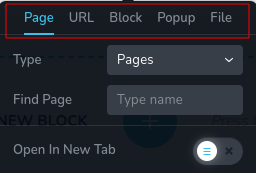
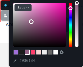
Example of the tabs with position left:
Parameters
| Name | Type | Default | Description |
|---|---|---|---|
id | string | - | The identifier of the key where the tabs will save your data. |
type | string | - | Type should be "tabs" to use this control. |
roles? | Array<Role> | - | Render the control only if the current user's role matches one of the roles in the provided array. **`type Role = "admin" \ |
tabs | Array<TabItem> | [ ] | An array defining the tabs next to the content. Each tab is represented by an object. TabItem: { id: string; className?: string; title?: string; label?: string; position?: number; options?: ControlItems[]; } id - the unique identifier for each individual tab. className - allows you to customize the appearance of the tab item by applying custom styles. title - the title displayed on the tab, representing the content section associated with that tab. label - an additional label or description for the tab, providing further context or information about the content section it represents. position - specifies the position of the tab . options - an array of controls objects representing the content associated with each tab. ControlItem: { id: string; type: string; className?: string; title?: string; label?: string; position?: number; } id - this property uniquely identifies each control item and is derived from a saved option value. It represents an identifier associated with a specific configuration or option selected. className - CSS class name that allows customization of the control's appearance via custom styles. title - the title displayed on the control, representing the content section associated with that TabItems. label - an additional label or description for the control, providing further context or information about the content section it represents. position - specifies the position of the control within the TabItems. type - type of control. |
position? | number | - | The position of the control in toolbar. |
devices? | "all" | "desktop" | "responsive" | "all" | Define the devices where the control will be rendered. "all" renders the control on all devices. "desktop" renders the control only on desktop devices. "responsive" renders the control on both tablet and mobile devices. |
disabled? | boolean | false | Configure the condition under which the control is disabled or enabled. |
config?.showSingle | boolean | false | Show the label if you have just one tab. |
config?.saveTab | boolean | false | Save the currently active tab upon closing the toolbar, ensuring that it remains the same when the toolbar is reopened. |
config?.position | "top" | "left" | "top" | The spatial location or placement of an element relative to container. |
config?.align | "start" | "center" | "end" | "center" | Specifies the position of label inside tab. |
default? | Default | - | The default control value. Default: { value: string; } value - the control's custom initial value |
style? | function | - | This function generates CSS output based on the value from the control. The parameter is an object containing a value key, which holds the current value of the control.The function returns an object with a CSS selector key and CSS property values.
|
Basic example
Standard definition with only the required keys. This control will be displayed on all devices.
{
  id: "actionTabs",
  type: "tabs",
  tabs: [
    {
      id: "upload",
      label: "File",
      options: [
        {
          id: "linkUpload",
          label: "File",
          type: "fileUpload"
        }
      ]
    },
    {
      id: "action",
      label: "Action",
      options: [
        {
          id: "actionClosePopup",
          label: "Close Popup",
          type: "switch"
        }
      ]
    }
  ]
}
Return value
A string representing the selected tab is returned only when config.saveTab is set to true.
{
  value: string;
}
Example of value:
{
  value: "action"
}
Usage
Roles example
Show the control only to users with admin and designer privileges.
{
  id: "actionTabs",
  type: "tabs",
  roles: ["admin", "designer"]
}
Devices examples
It will be rendered on all devices. This value can be skipped because it is set to "all" by default.
{
  id: "actionTabs",
  type: "tabs",
  devices: "all",
  tabs: [
    {
      id: "upload",
      label: "File",
      options: [
        {
          id: "linkUpload",
          label: "File",
          type: "fileUpload"
        }
      ]
    },
    {
      id: "action",
      label: "Action",
      options: [
        {
          id: "actionClosePopup",
          label: "Close Popup",
          type: "switch"
        }
      ]
    }
  ]
}
Rendering will occur only on desktop.
{
  id: "actionTabs",
  type: "tabs",
  devices: "desktop",
  tabs: [
    {
      id: "upload",
      label: "File",
      options: [
        {
          id: "linkUpload",
          label: "File",
          type: "fileUpload"
        }
      ]
    },
    {
      id: "action",
      label: "Action",
      options: [
        {
          id: "actionClosePopup",
          label: "Close Popup",
          type: "switch"
        }
      ]
    }
  ]
}
The display is limited to responsive modes, specifically tablet and mobile.
{
  id: "actionTabs",
  type: "tabs",
  devices: "responsive",
  tabs: [
    {
      id: "upload",
      label: "File",
      options: [
        {
          id: "linkUpload",
          label: "File",
          type: "fileUpload"
        }
      ]
    },
    {
      id: "action",
      label: "Action",
      options: [
        {
          id: "actionClosePopup",
          label: "Close Popup",
          type: "switch"
        }
      ]
    }
  ]
}
Disabled examples
Control will be disabled. Normally, here should be your dynamic condition.
{
  id: "actionTabs",
  type: "tabs",
  disabled: true,
  tabs: [
    {
      id: "upload",
      label: "File",
      options: [
        {
          id: "linkUpload",
          label: "File",
          type: "fileUpload"
        }
      ]
    },
    {
      id: "action",
      label: "Action",
      options: [
        {
          id: "actionClosePopup",
          label: "Close Popup",
          type: "switch"
        }
      ]
    }
  ]
}
Control will be disabled when videoType variable will be "custom".
getValue is a getter function that allows us to retrieve the value of controls by their id.
"videoType" is the id of the "select" control below.
const getToolbarContols = ({ getValue }) => {
  const videoType = getValue("videoType");

  return [
    {
      id: "videoType",
      type: "select",
      choices: [
        { title: "Youtube", value: "youtube" },
        { title: "Custom", value: "custom" }
      ]
    },
    {
      id: "actionTabs",
      type: "tabs",
      disabled: videoType === "custom",
      tabs: [
        {
          id: "upload",
          label: "File",
          options: [
            {
              id: "linkUpload",
              label: "File",
              type: "fileUpload"
            }
          ]
        },
        {
          id: "action",
          label: "Action",
          options: [
            {
              id: "actionClosePopup",
              label: "Close Popup",
              type: "switch"
            }
          ]
        }
      ]
    }
  ]
}
Config showSingle example
If you have just one tab but you want to see the label Link you should set the showSingle to true.
{
  id: "actionTabs",
  type: "tabs",
  config: {
    showSingle: true
  },
  tabs: [
    {
      id: "upload",
      label: "File",
      options: [
        {
          id: "linkUpload",
          label: "File",
          type: "fileUpload"
        }
      ]
    },
    {
      id: "action",
      label: "Action",
      options: [
        {
          id: "actionClosePopup",
          label: "Close Popup",
          type: "switch"
        }
      ]
    }
  ]
}
Config saveTab example
To ensure that tab remains the same when the toolbar is reopened, set saveTab to true.
{
  id: "actionTabs",
  type: "tabs",
  config: {
    saveTab: true
  },
  tabs: [
    {
      id: "upload",
      label: "File",
      options: [
        {
          id: "linkUpload",
          label: "File",
          type: "fileUpload"
        }
      ]
    },
    {
      id: "action",
      label: "Action",
      options: [
        {
          id: "actionClosePopup",
          label: "Close Popup",
          type: "switch"
        }
      ]
    }
  ]
}
Config position example
If you would like to place the tabs on the side of the container, set their position to "left".
{
  id: "actionTabs",
  type: "tabs",
  config: {
    position: "left"
  },
  tabs: [
    {
      id: "upload",
      label: "File",
      options: [
        {
          id: "linkUpload",
          label: "File",
          type: "fileUpload"
        }
      ]
    },
    {
      id: "action",
      label: "Action",
      options: [
        {
          id: "actionClosePopup",
          label: "Close Popup",
          type: "switch"
        }
      ]
    }
  ]
}
Config align example
If you would like to align the label inside the tabs on the x-axis, you could choose one of the positions: "start", "center", or "end".
{
  id: "actionTabs",
  type: "tabs",
  config: {
    align: "end"
  },
  tabs: [
    {
      id: "upload",
      label: "File",
      options: [
        {
          id: "linkUpload",
          label: "File",
          type: "fileUpload"
        }
      ]
    },
    {
      id: "action",
      label: "Action",
      options: [
        {
          id: "actionClosePopup",
          label: "Close Popup",
          type: "switch"
        }
      ]
    }
  ]
}
Default value examples
In this example, the tabs control, with the default value "external".
{
  id: "actionTabs",
  type: "tabs",
  default: {
    value: "external"
  }
}
CSS style example
This code dynamically adjusts the display style of elements with the class .brz-container based on the value value. If the value is "tabIcon", the elements are displayed as block elements; otherwise, they are hidden.
{
  id: "actionTabs",
  type: "tabs",
  style: ({ value }) => {

    if (value && value.value === "tabIcon") {
      return {
        ".brz-container.brz-tab-color": {
          display: "none"
        }
      }
    }

    return {
      ".brz-container.brz-tab": {
        display: "block"
      }
    }
  }
}
Usage in HTML example
In the example below, we define a custom Container component tailored for the Brizy editor. This component facilitates the injection of custom HTML, thereby enhancing customization possibilities. It ensures that when any tab is active, the component receives the active tab via props, ensuring that config.saveTab is set to true.
import { Brizy } from "@brizy/core";
import React, { JSX } from "react";


interface Props {
  tabsColor: string;
}

const Container = (props: Props): JSX.Element => {
  const { tabsColor } = props;

  return (
    <div className="brz-container">{ tabsColor === "tabsColor" && <Button/> }</div>
  );
};

Brizy.registerComponent({
  id: "ThirdParty.Container",
  component: { editor: Container, view: Container },
  title: "My Container",
  category: "essentials",
  options: (props) => {
    return [
      {
        selector: ".brz-container",
        toolbar: [
          {
            id: "tabsColor",
            type: "tabs",
            config: {
              saveTab: true
            },
            tabs: [
              {
                id: "tabCloseIcon",
                label: "Icon",
                options: [
                  {
                    id: "closeColor",
                    type: "colorPicker",
                  }
                ]
              },
              {
                id: "tabBackground",
                label: "Background",
                options: [
                  {
                    id: "closeBgColor",
                    type: "colorPicker"
                  }
                ]
              }
            ]
          }
        ]
      }
    ];
  }
});