Slider
Slider control allows users to select a numerical value by dragging a slider handle. Developers can set minimum and maximum values, step intervals, and units of measurement. Additionally, the component supports both immediate and debounced updates to optimize performance and user experience.
Example of slider:
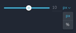
Example of slider with multiple units provided:
Parameters
| Name | Type | Default | Description |
|---|---|---|---|
id | string | - | The identifier of the key where the slider will save your data |
type | string | - | Type should be "slider" to use this control |
label? | string | - | The label displayed on the left side of the control |
className? | string | - | The custom CSS class name that will be set on the control. It can be used to modify the control styles |
icon? | string | - | Icon name that will be rendered on left side of the control's label. View all icons |
position? | number | - | The position of the control in toolbar |
roles? | Array<Role> | - | Render the control only if the current user's role matches one of the roles in the provided array. type Role = "admin" | "viewer" | "editor" | "designer" | "manager" |
devices? | "all" | "desktop" | "responsive" | "all" | Define the devices where the control will be rendered. "all" renders the control on all devices. "desktop" renders the control only on desktop devices. "responsive" renders the control on both tablet and mobile devices |
disabled? | boolean | false | Configure the condition under which the control is disabled or enabled |
display? | "inline" | "block" | "inline" | Configure how the control and its label will be arranged. If display is "inline" then label and control will be in one row, if display is "block" then label will be in one row, and the next row down will be the control |
helper?.content | string | - | If provided, displays an icon next to the label. When hovering over this icon, a tooltip with additional information appears |
helper?.position | "top-start" | "top" | "top-end" | "right-start" | "right" | "right-end" | "bottom-end" | "bottom" | "bottom-start" | "left-end" | "left" | "left-start" | "top" | Specifies the position of the tooltip relative to the helper icon |
states? | Array<State> | ["normal"] | Allows for different styles based on the element's state State = "normal" | "hover" | "active" "normal" - the normal state of an element, "hover" - the state when the element is hovered over, "active" - the state when the element is active (e.g., current page in pagination) |
config?.min | number | 0 | The minimum value that can be obtained by dragging the slider handle |
config?.max | number | 100 | The maximum value that can be obtained by dragging the slider handle |
config?.inputMin | number | - | The minimum value that can be entered directly into the input field. If the user inputs a value lower than this, it will be automatically corrected to this minimum value |
config?.inputMax | number | - | The maximum value that can be entered directly into the input field. If the user inputs a value higher than this, it will be automatically corrected to this maximum value |
config?.step | number | 1 | The step interval for changing the slider value |
config?.units | Array<Unit> | [ ] | The units of measurement displayed next to the slider value. Accepts all possible CSS units ("px", "%", "em" and others) and your custom values Unit: { value: string; title: string; } value - a valid CSS unit or your custom value title - a text representation of the value |
config?.size | "short" | "medium" | "large" | "auto" | "auto" | The size of the slider component |
config?.debounceUpdate | boolean | false | Determines whether the UI is updated using debouncing instead of throttling |
config?.updateRate | number | 50 | The delay in milliseconds after which the UI responds to value changes |
default? | Default | - | The default control value. Default: { value: number; suffix: string; } value - the default number of the control suffix - your custom or CSS unit ("px", "%", "em" and others), will be active in the dropdown if multiple units are available |
style? | function | - | This function generates CSS output based on the value from the control. The parameter is an object containing a value key, which holds the current value of the control. The function returns an object with a CSS selector key and CSS property values.
|
Basic example
Standard definition with only the required keys. This control will be displayed on all devices.
{
  id: "width",
  type: "slider"
}
Return value
Control returns an object where value is the current slider value and unit is the unit provided in config.units or it is the current selected unit from the dropdown, if multiple units are available.
{
  value: number;
  unit: string;
}
Example of the value:
{
  value: 50,
  unit: "px"
}
Usage
Label example
Adding a label on the left side of the control.
{
  id: "width",
  label: "Width",
  type: "slider"
}
Class name example
Adding a CSS class to the control's DOM node.
{
  id: "width",
  type: "slider"
  className: "mySlider"
}
Icon example
Adding some icon to the left of the control's label.
{
  id: "width",
  type: "slider"
  icon: "nc-cog"
}
Roles example
Show the control only to users with admin and designer privileges.
{
  id: "width",
  type: "slider",
  roles: ["admin", "designer"]
}
Devices examples
It will be rendered on all devices. This value can be skipped because it is set to "all" by default.
{
  id: "width",
  type: "slider",
  devices: "all"
}
Rendering will occur only on desktop.
{
  id: "width",
  type: "slider",
  devices: "desktop"
}
The display is limited to responsive modes, specifically tablet and mobile.
{
  id: "width",
  type: "slider",
  devices: "responsive"
}
Disabled example
Control will be disabled. Normally, here should be your dynamic condition.
{
  id: "width",
  type: "slider",
  disabled: true
}
Control will be disabled when videoType variable will be "custom".
getValue is a getter function that allows us to retrieve the value of controls by their id.
"videoType" is the id of the "select" control below.
const getToolbarContols = ({ getValue }) => {
  const videoType = getValue("videoType");

  return [
    {
      id: "videoType",
      type: "select",
      choices: [
        { title: "Youtube", value: "youtube" },
        { title: "Custom", value: "custom" }
      ]
    },
    {
      id: "width",
      type: "slider",
      disabled: videoType === "custom"
    }
  ]
}
Display example
In this example, with display: "block", the label will be rendered on the first row and the control on the second.
{
  id: "width",
  type: "slider"
  display: "block"
}
Helper example
The helper object contains a content property with the value "help text", which will be displayed as additional
guidance or information for the user.
{
  id: "width",
  type: "slider",
  helper: {
    content: "help text"
  }
}
When the helper object contains a position property with the value "top-start", it indicates that the helper text will
be displayed to the top left corner of the icon.
{
  id: "width",
  type: "slider",
  helper: {
    content: "help text",
    position: "top-start"
  }
}
States examples
Allows the control to work in normal and hover states.
{
  id: "width",
  type: "slider",
  states: ["normal", "hover"]
}
Allows the control to work in normal, hover and active states.
{
  id: "width",
  type: "slider",
  states: ["normal", "hover", "active"]
}
Config min example
The minimum value that can be obtained by dragging the slider handle.
{
  id: "width",
  type: "slider",
  config: {
    min: 0
  }
}
Config max example
The maximum value that can be obtained by dragging the slider handle.
{
  id: "width",
  type: "slider",
  config: {
    max: 0
  }
}
Config inputMin example
Specifies the minimum number you can type in input field. If the user inputs a value lower than this, it will be automatically corrected to this minimum value.
{
  id: "width",
  type: "slider",
  config: {
    inputMin: 0
  }
}
Config inputMax example
Specifies the maximum number you can type in input field. If the user inputs a value higher than this, it will be automatically corrected to this maximum value.
{
  id: "width",
  type: "slider",
  config: {
    inputMax: 100
  }
}
Config step example
The step interval for changing the slider value by dragging the slider handle.
{
  id: "width",
  type: "slider",
  config: {
    step: 2
  }
}
Config units example
The units of measurement displayed next to the slider value. Accepts CSS units like "px", "em", "%", "vh", "vw", and so on.
{
  id: "width",
  type: "slider",
  config: {
    units: [
      { value: "px", title: "px" },
      { value: "%", title: "%" }
    ]
  }
}
Config size example
The size of the slider component, can be "small", "medium", or "large".
{
  id: "width",
  type: "slider",
  config: {
    size: "medium"
  }
}
Config debounceUpdate and updateRate example
Determines whether the slider value is updated using debouncing instead of throttling. When set to true, the slider value will update only after a period of inactivity, defined by updateRate.
{
  id: "width",
  type: "slider",
  config: {
    debounceUpdate: true,
    updateRate: 500
  }
}
Default value example
In this case, the value of the slider will be equal to 50 and active unit will be "px".
{
  id: "width",
  type: "slider",
  config: {
    units: [
      { title: "px", value: "px" },
      { title: "%", value: "%" }
    ]
  },
  default: {
    value: 50,
    suffix: "px"
  }
}
CSS example
Adjust the width of an element using the value from a slider control with CSS.
{
  id: "width",
  type: "slider",
  style: ({ value }) => {
    return {
      "{{WRAPPER}} .brz-map": {
        width: value.value.toString() + (value.unit ?? "%")
      }
    };
  }
}
Usage in HTML example
To retrieve the control's return value, access the slider's current value and its suffix through the component's props.
Specifically, use the id of your slider to obtain the value, and the id concatenated with "Suffix" to obtain the suffix.
These values can then be utilized as needed, either by passing them to another component or by using them at the current
level.
import { Brizy } from "@brizy/core";

interface Props {
  width: number;
  widthSuffix: string;
}

const Component = (props: Props): JSX.Element => {
  const { width, widthSuffix } = props;

  return <div className="component" style={{ width: `${width}${widthSuffix}` }}>...</div>
}

Brizy.registerComponent({
  id: "ThirdParty.Component",
  component: { editor: Component, view: Component },
  title: "Component",
  category: "custom",
  options: (props) => {
    return [
      {
        selector: ".component",
        toolbar: [
          {
            id: "toolbarCurrentElement",
            type: "popover",
            config: {
              icon: "nc-cog",
              title: "Settings"
            },
            devices: "desktop",
            options: [
              {
                id: "width",
                type: "slider",
                devices: "desktop",
                default: {
                  value: 50,
                  suffix: "px"
                },
                config: {
                  units: [
                    { value: "px", unit: "px" },
                    { value: "%", unit: "%" }
                  ]
                }
              }
            ]
          }
        ]
      }
    ]
  }
})