Sidebar Tabs Button
The sidebarTabsButton is a user interface component. It functions as a clickable button allowing users to open the sidebar at a specific tab.
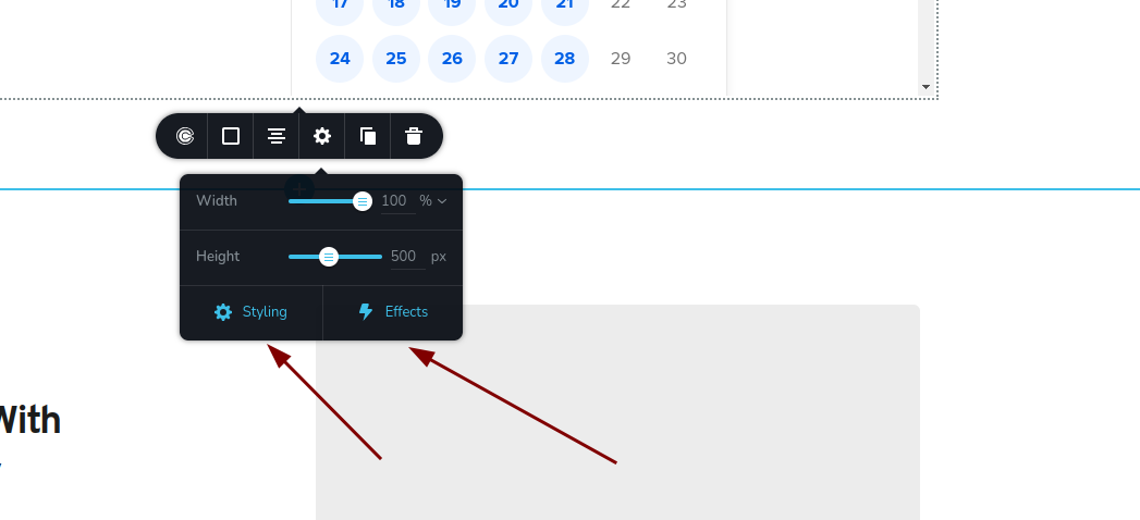
Example of sidebarTabsButton control:
Parameters
| Name | Type | Default | Description |
|---|---|---|---|
id | string | - | The identifier of the key where the sidebarTabsButton will save your data |
type | string | - | Type should be "sidebarTabsButton" to use this control |
devices? | "all" | "desktop" | "responsive" | "all" | Define the devices where the control will be rendered. "all" renders the control on all devices. "desktop" renders the control only on desktop devices. "responsive" renders the control on both tablet and mobile devices |
disabled? | boolean | false | Configure the condition under which the control is disabled or enabled |
config?.tabId | string | - | Specifies the id of the tab on the sidebar that will be opened when the sidebarTabsButton is clicked |
config?.icon | string | - | The icon name of the button |
config?.align | "left" | "center" | "right" | "center" | The alignment of the button |
config?.text | string | - | The text displayed on the button |
Basic example
Standard definition with only the required keys. This control will be displayed on all devices.
{
  id: "button",
  type: "sidebarTabsButton"
}
Return value
The sidebarTabsButton control does not return anything.
Usage
Devices examples
It will be rendered on all devices. This value can be skipped because it is set to "all" by default.
{
  id: "button",
  type: "sidebarTabsButton",
  devices: "all"
}
Rendering will occur only on desktop.
{
  id: "button",
  type: "sidebarTabsButton",
  devices: "desktop"
}
The display is limited to responsive modes, specifically tablet and mobile.
{
  id: "button",
  type: "sidebarTabsButton",
  devices: "responsive"
}
Disabled examples
Control will be disabled. Normally, here should be your dynamic condition.
{
  id: "button",
  type: "sidebarTabsButton",
  disabled: true
}
Control will be disabled when videoType variable will be "custom".
getValue is a getter function that allows us to retrieve the value of controls by their id.
"videoType" is the id of the "select" control below.
const getToolbarContols = ({ getValue }) => {
  const videoType = getValue("videoType");

  return [
    {
      id: "videoType",
      type: "select",
      choices: [
        { title: "Youtube", value: "youtube" },
        { title: "Custom", value: "custom" }
      ],
    },
    {
      id: "button",
      type: "sidebarTabsButton",
      disabled: videoType === "custom"
    },
  ];
};
Config tabId example
Specifies the id of the tab on the sidebar that will be opened.
{
  id: "button",
  type: "sidebarTabsButton",
  config: {
    tabId: "style"
  }
}
Config icon example
Specifies the icon to be displayed with the control.
{
  id: "button",
  type: "sidebarTabsButton",
  config: {
    icon: "nc-flash"
  }
}
Config align example
Sets the alignment of the control.
{
  id: "button",
  type: "sidebarTabsButton",
  config: {
    align: "left"
  }
}
Config text example
Defines the text to be displayed with the control.
{
  id: "button",
  type: "sidebarTabsButton",
  config: {
    text: "Effects"
  }
}