Border
The border control designed to provide flexible styling options for the border of an element. It allows you to customize the color, style, opacity, and width of the border as a whole, or individually for each side (top, right, bottom, left).
Example of the control:
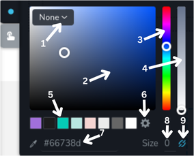
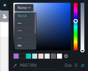
- Border style dropdown menu - this dropdown menu allows you to choose which style to apply to the border. By default, it has 9 options.
- Color selector area - this is where you can pick the exact color by clicking on the desired point within the color gradient.
- Hue slider - this vertical slider allows you to choose the hue (basic color) you want to work with.
- Opacity slider - this slider lets you adjust the opacity of the selected color.
- Color presets - these are preset color options from global styles that you can quickly select.
- Settings icon - opens sidebar with the global styles.
- Hex color input - this area shows the hexadecimal color code of the selected color and allows you to input a specific hex code to choose a color directly. The eyedropper icon next to it lets you select any color from anywhere on the page by clicking on it.
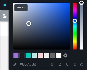
- Border width - this input field allows you to specify the border width.
- Border width type - this icon allows to choose between changing border width for all sides at once or each side individually.
Example of the control with dropdown to select border style:
Example of the control with 4 input fields to specify border width for each side:
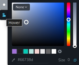
Example of the control with state "hover":
Parameters
| Name | Type | Default | Description |
|---|---|---|---|
id | string | - | The identifier of the key where the border will save your data |
type | string | - | Type should be "border" to use this control |
className? | string | - | The custom CSS class name that will be set on the control. It can be used to modify the control styles. |
position? | number | - | The position of the control in toolbar |
roles? | Array<Role> | - | Render the control only if the current user's role matches one of the roles in the provided array. type Role = "admin" | "viewer" | "editor" | "designer" | "manager" |
devices? | "all" | "desktop" | "responsive" | "all" | Define the devices where the control will be rendered. "all" renders the control on all devices. "desktop" renders the control only on desktop devices. "responsive" renders the control on both tablet and mobile devices |
disabled? | boolean | false | Configure the condition under which the control is disabled or enabled |
states? | Array<State> | ["normal"] | Allows for different styles based on the element's state State = "normal" | "hover" | "active" "normal" - the normal state of an element, "hover" - the state when the element is hovered over, "active" - the state when the element is active (e.g., current page in pagination) |
config?.styles | Array<Style> | ["none","solid","dashed","dotted","double","groove","ridge","inset","outset"] | Defines the available border styles that can be applied. By default, it includes 9 styles, which are all CSS border-style values Style = "none" | "solid" | "dashed" | "dashed" | "dotted" | "double" | "groove" | "ridge" | "inset" | "outset" |
config?.width | Array<WidthType> | ["grouped", "ungrouped"] | Allows specifying whether the width of the border can be changed individually for each side or as a whole WidthType = "grouped" | "ungrouped" "grouped" - allows changing the width of the border for all sides at once, "ungrouped" - allows changing the width of the border individually for each side |
config?.opacity | boolean | true | Controls whether the opacity of the border can be changed |
default? | Default | - | The default control value. Default: {colorHex: string;colorOpacity: number;colorPalette: string;style: string;widthType: "grouped" | "ungrouped";width: number;topWidth: number;rightWidth: number;bottomWidth: number;leftWidth: number;} colorHex - the color of the border in hexadecimal format; colorOpacity - specifies the opacity of the border; colorPalette - a predefined palette from global styles; style - the current style of the border; widthType - the current width type; width - value which is applied for all sides of the border (changes when "widthType" is "grouped"); topWidth - the width of the top border; rightWidth - the width of the right border; bottomWidth - the width of the bottom border; leftWidth - the width of the left border; |
selector? | string | - | The CSS selector to which the styles will be applied |
style? | function | - | This function generates CSS output based on the value from the control. The parameter is an object containing a value key, which holds the current value of the control. The function returns an object with a CSS selector key and CSS property values.
|
Basic example
Standard definition with only the required keys. This control will be displayed on all devices.
{
  id: "border",
  type: "border"
}
Return value
Returns an object with the following values:
{
  colorHex: string;
  colorOpacity: number;
  colorPalette: string;
  style: string;
  widthType: "grouped" | "ungrouped";
  width: number;
  topWidth: number;
  rightWidth: number;
  bottomWidth: number;
  leftWidth: number;
}
colorHex - the color of the border in hexadecimal format;
colorOpacity - specifies the opacity of the border;
colorPalette - a predefined palette from global styles;
style - the current style of the border;
widthType - the current width type;
width - value which is applied for all sides of the border (changes when "widthType" is "grouped");
topWidth - the width of the top border;
rightWidth - the width of the right border;
bottomWidth - the width of the bottom border;
leftWidth - the width of the left border;
Example of value:
{
  colorHex: "#dcdee1",
  colorOpacity: 1,
  colorPalette: "",
  style: "solid",
  widthType: "grouped",
  width: 2,
  topWidth: 2,
  rightWidth: 2,
  bottomWidth: 2,
  leftWidth: 2
}
Usage
Class name example
Adding a CSS class to the control's DOM node.
{
  id: "border",
  type: "border",
  className: "myCustomClass"
}
Roles example
Show the control only to users with admin and designer privileges.
{
  id: "border",
  type: "border",
  roles: ["admin", "designer"]
}
Devices examples
It will be rendered on all devices. This value can be skipped because it is set to "all" by default.
{
  id: "border",
  type: "border",
  devices: "all"
}
Rendering will occur only on desktop.
{
  id: "border",
  type: "border",
  devices: "desktop"
}
The display is limited to responsive modes, specifically tablet and mobile.
{
  id: "border",
  type: "border",
  devices: "responsive"
}
Disabled examples
Control will be disabled. Normally, here should be your dynamic condition.
{
  id: "border",
  type: "border",
  disabled: true
}
Control will be disabled when videoType variable will be "custom".
getValue is a getter function that allows us to retrieve the value of controls by their id.
"videoType" is the id of the "select" control below.
const getToolbarContols = ({ getValue }) => {
  const videoType = getValue("videoType");

  return [
    {
      id: "videoType",
      type: "select",
      choices: [
        { title: "Youtube", value: "youtube" },
        { title: "Custom", value: "custom" }
      ]
    },
    {
      id: "border",
      type: "border",
      disabled: videoType === "custom"
    }
  ]
}
States example
Allows the control to work in normal and hover states.
{
  id: "border",
  type: "border",
  states: ["normal", "hover"]
}
Allows the control to work in normal, hover and active states.
{
  id: "border",
  type: "border",
  states: ["normal", "hover", "active"]
}
Config styles example
Defines the available border styles that will be available to select.
{
  id: "border",
  type: "border",
  config: {
    styles: ["none", "solid"]
  }
}
Config width example
Allows specifying whether the width of the border can be changed individually for each side or as a whole. In this case you will not have a possibility to change the sides of the border separately.
{
  id: "border",
  type: "border",
  config: {
    width: ["grouped"]
  }
}
Config opacity example
Controls whether the opacity of the border can be changed.
{
  id: "border",
  type: "border",
  config: {
    opacity: false
  }
}
Default value examples
In this example, the border control that has the default values.
{
  id: "border",
  type: "border",
  default: {
    colorHex: "#dcdee1",
    colorOpacity: 1,
    colorPalette: "",
    style: "solid",
    widthType: "grouped",
    width: 2,
    topWidth: 2,
    rightWidth: 2,
    bottomWidth: 2,
    leftWidth: 2
  }
}
CSS examples
Configure the CSS border property of the .brz-button element using selector. All the styles will be
applied automatically.
{
  id: "border",
  type: "border",
  states: ["normal", "hover"],
  selector: "{{WRAPPER}}:hover .brz-button"
}
Set the border for .brz-button element with CSS using a border control value.
{
  id: "border",
  type: "border",
  style: ({ value }) => {
    if(value.widthType === "ungrouped") {
       return {
         "{{WRAPPER}} .brz-button":
           {
             border: `${value.width}px ${value.style} ${value.colorHex}`,
             "border-top-width": `${value.topWidth}px`,
             "border-bottom-width": `${value.bottomWidth}px`,
             "border-left-width": `${value.leftWidth}px`,
             "border-right-width": `${value.rightWidth}px`
           }
       }
    }

    return {
      "{{WRAPPER}} .brz-button": {
        border: `${value.width}px ${value.style} ${value.colorHex}`
      }
    }
  }
}
Usage in HTML example
In the example below, we use the border output value to determine specific classes for the button element.
import { Brizy } from "@brizy/core";
import React, { JSX } from "react";
import { Icon } from "./Icon";

interface Props {
  borderColorHex: string;
  borderColorOpacity: number;
  borderColorPalette: string;
  borderStyle: string;
  borderWidthType: "grouped" | "ungrouped";
  borderWidth: number;
  borderTopWidth: number;
  borderRightWidth: number;
  borderBottomWidth: number;
  borderLeftWidth: number;
}

const Button = (props: Props): JSX.Element => {
  const { border } = props;

  const groupedBorder = `${border}px`;
  const ungroupedBorder = `${borderTop}px ${borderRight}px ${borderBottom}px ${borderLeft}px`;

  return (
    <div
      className={`brz-button ${border.borderStyle}`}
      style={border.borderWidthType === "grouped" ? groupedBorder : ungroupedBorder}
    >
      Click
    </div>
  );
};

Brizy.registerComponent({
  id: "ThirdParty.Button",
  component: { editor: Button, view: Button },
  title: "My Button",
  category: "custom",
  options: (props) => {
    return [
      {
        selector: ".brz-button",
        toolbar: [
          {
            id: "toolbarCurrentElement",
            type: "popover",
            config: {
              icon: "nc-button",
              title: "Button"
            },
            devices: "desktop",
            options: [
              {
                id: "border",
                type: "border",
                devices: "desktop"
              }
            ]
          }
        ]
      }
    ]
  }
})