Gallery
The gallery control displays a file chooser section that allows the user to upload multiple images from their device storage.
Example of empty gallery:

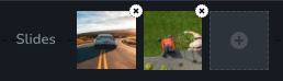
Example of gallery with uploaded images:
Parameters
| Name | Type | Default | Description |
|---|---|---|---|
id | string | - | The identifier of the key where the control will save your data |
type | string | - | Type should be "gallery" to use this control |
label? | string | - | The label displayed on the left side of the control |
icon? | string | - | Icon name that will be rendered on left side of the control's label. View all icons. |
position? | number | - | The position of the control in toolbar |
devices? | "all" | "desktop" | "responsive" | "all" | Define the devices where the control will be rendered. "all" renders the control on all devices. "desktop" renders the control only on desktop devices. "responsive" renders the control on both tablet and mobile devices. |
disabled? | boolean | false | Configure the condition under which the control is disabled or enabled. |
disabled? | boolean | false | Configure the condition under which the control is disabled or enabled. |
display? | "inline" | "block" | "inline" | Configure how the control and its label will be arranged. If display is "inline" then label and control will be in one row, if display is "block" then label will be in one row, and the next row down will be the control. |
helper?.content | string | - | If provided, an icon is displayed next to the label. When hovering over this icon, a tooltip with additional information appears. |
helper?.position | "top-start" | "top" | "top-end" | "right-start" | "right" | "right-end" | "bottom-end" | "bottom" | "bottom-start" | "left-end" | "left" | "left-start" | "top" | "top" | Specifies the position of the tooltip relative to the helper icon |
states? | Array<State> | ["normal"] | Allows for different styles based on the element's state State = "normal" | "hover" | "active" "normal" - the normal state of an element, "hover" - the state when the element is hovered over, "active" - the state when the element is active (e.g., current page in pagination) |
config?.canDeleteLast | boolean | true | If provided and set to false, the user cannot delete the last item in the gallery. |
default? | Default | - | Default: { value: string; }The default control value should be a JSON.stringify of Image[]. Image: { id: number; uid: string; fileName: string; width: number; height: number; } id - The index of the image in the gallery uid - The unique identifier of the imagefileName - The unique identifier of the imagewidth - The width of the imageheight - The height of the image |
style? | function | - | This function generates CSS output based on the value from the control. The parameter is an object containing a value key, which holds the current value of the control. The function returns an object with a CSS selector key and CSS property values.
|
Basic example
Standard definition with only the required keys. This control will be displayed on all devices.
{
  id: "slides",
  type: "gallery"
}
Return value
Returns a stringified array of objects with the following values:
{
  id: number;
  uid: string;
  fileName: string;
  width: number;
  height: number;
}
Example:
{
  value: '[
    {
      "id": 1,
      "uid": "dbe3a79df22c4ef2ac6553aa241d2c5c.jpg",
      "fileName": "image1.jpg",
      "width": 1600,
      "height": 1042
    },
    {
      "id": 2,
      "uid": "a7c45ea83554c81024b84d724fd8286d.jpg",
      "fileName": "image2.jpg",
      "width": 640,
      "height": 359
    }
  ]'
}
Usage
Label example
Adding a label on the left side of the control.
{
  id: "slides",
  type: "gallery",
  label: "Slide Show"
}
Icon example
Adding a "gallery" icon to the left of the control's label.
{
  id: "slides",
  type: "gallery",
  icon: "nc-gallery"
}
Devices examples
It will be rendered on all devices. This value can be skipped because it is set to "all" by default.
{
  id: "slides",
  type: "gallery",
  devices: "all"
}
Rendering will occur only on desktop.
{
  id: "slides",
  type: "gallery",
  devices: "desktop"
}
The display is limited to responsive modes, specifically tablet and mobile.
{
  id: "slides",
  type: "gallery",
  devices: "responsive"
}
Disabled examples
Control will be disabled. Normally, here should be your dynamic condition.
{
  id: "slides",
  type: "gallery",
  disabled: true
}
Control will be disabled when mediaType variable will be not "slideshow".
getValue is a getter function that allows us to retrieve the value of controls by their id.
"mediaType" is the id of the "radioGroup" control below.
const getToolbarContols = ({ getValue }) => {
  const mediaType = getValue("media");

  return [
    {
      id: "media",
      type: "radioGroup",
      label: "Type",
      choices: [
        { value: "image", icon: "nc-media-image" },
        { value: "video", icon: "nc-media-video" },
        { value: "slideshow", icon: "nc-reorder" }
      ]
    },
    {
      id: "slides",
      type: "gallery",
      disabled: mediaType !== "slideshow"
    }
  ]
}
Display examples
In this example, with display: "block", the label will be rendered on the first row and the control on the second.
{
  id: "slides",
  type: "gallery",
  display: "block"
}
Helper examples
The helper object contains a content property with the value "Helper", which will be displayed as additional guidance or information for the user.
{
  id: "slides",
  type: "gallery",
  helper: {
    content: "Helper"
  }
}
When the helper object contains a position property with the value "top-start", indicating that the helper text will be displayed at the top start of icon.
{
  id: "slides",
  type: "gallery",
  helper: {
    content: "Helper",
    position: "top-start"
  }
}
States example
Allows the control to work in normal and hover states.
{
  id: "slides",
  type: "gallery",
  states: ["normal", "hover"]
}
Allows the control to work in normal, hover and active states.
{
  id: "slides",
  type: "gallery",
  states: ["normal", "hover", "active"]
}
Config canDeleteLast example
In this example, the user cannot remove the last item in the gallery.
{
  id: "slides",
  type: "gallery",
  config: {
    canDeleteLast: false
  }
}
Default value examples
In this example, setting a default value for the gallery control.
{
  id: "slides",
  type: "gallery",
  default: {
    value: '[
      {
        id: "1",
        uid:"dbe6479df22c4ef2ac6553aa241d2c5c.jpg",
        fileName: "image1.jpg",
        width: 800,
        height: 600
      },
      {
        id: "2",
        uid:"fbe6479df22c4ef2ac6555te241d2c5c.jpg",
        fileName: "image2.jpg",
        width: 1024,
        height: 768
      }
    ]'
  }
}
CSS examples
In this example shows how to apply basic styles to the gallery images.
{
  id: "slides",
  type: "gallery",
  style: ({ value }) => {
  return value.reduce((styles, image, index) => {
    styles[`{{WRAPPER}} .brz-gallery .brz-image-${index}`] = {
      backgroundImage: `url(${image.fileName})`,
      width: `${image.width}px`,
    };
    return styles;
  }, {});
}
}
Usage in HTML example
import { Brizy } from "@brizy/core";
import React, { JSX } from "react";

interface Image {
  id: number;
  fileName: string;
  width: number;
  height: number;
}

interface Props {
  slides: string;
}

const Gallery = (props: Props): JSX.Element => {
  const { slides } = props;
  const images: Image[] = JSON.parse(slides);

  return (
    <div className="brz-gallery">
      {images.map((image) => (
        <div
          key={image.id}
          style={{
            backgroundImage: `url(${image.fileName})`,
            width: image.width,
            height: image.height
          }}
        />
      ))}
    </div>
  );
};


Brizy.registerComponent({
  id: "ThirdParty.Gallery",
  component: { editor: Gallery, view: Gallery },
  title: "My Gallery",
  category: "custom",
  options: (props) => {
    return [
      {
        selector: ".brz-gallery",
        toolbar: [
          {
            id: "toolbarCurrentElement",
            type: "popover",
            config: {
              icon: "nc-gallery",
              title: "Slides"
            },
            devices: "desktop",
            options: [
              {
                id: "slides",
                type: "gallery"
              }
            ]
          }
        ]
      }
    ];
  }
});