Popover
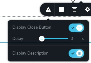
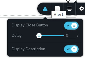
The popover control is a button trigger with an icon that allows for opening and closing a popover. Additionally, it can display a tooltip text when hovered over, providing more information about the button's purpose or function.
Example of the control:

Example of the control with hover on the button:

Parameters
| Name | Type | Default | Description |
|---|---|---|---|
id | string | - | A unique identifier for the popover. This is used to differentiate between multiple popovers |
type | string | - | Type should be "popover" to use this control |
className? | string | - | The custom CSS class name that will be set on the control. It can be used to modify the control styles. |
position? | number | - | The position of the control in toolbar |
roles? | Array<Role> | - | Render the control only if the current user's role matches one of the roles in the provided array. type Role = "admin" | "viewer" | "editor" | "designer" | "manager" |
devices? | "all" | "desktop" | "responsive" | "all" | Define the devices where the control will be rendered. "all" renders the control on all devices. "desktop" renders the control only on desktop devices. "responsive" renders the control on both tablet and mobile devices |
disabled? | boolean | false | Configure the condition under which the control is disabled or enabled |
options? | Array<ControlItem> | - | An array of controls that will be displayed inside the popover ControlItem = { id: number; type: string; label?: string; disabled?: boolean; devices?: "all" | "desktop" | "responsive" } id - id of the other control where it will store its data type - type of the control label - the label displayed on the left side of the control disabled - configure the condition under which the control is disabled or enabled devices - define the devices where the control will be rendered |
config?.placement | "auto" | "auto-start | "auto-end" | "top" | "top-start" | "top-end" | "bottom" | "bottom-start" | "bottom-end" | "right" | "right-start" | "right-end" | "left" | "left-start" | "left-end" | "top" | Determines the position of the popover relative to the button |
config?.size | "small" | "medium" | "large" | "xlarge" | "auto" | "medium" | Specifies the size of the popover |
config?.icon | string | "nc-cog" | The icon displayed within the button |
config?.title | string | - | The title attribute for the button, which appears as a tooltip when the user hovers over the button |
config?.onOpenDirect | boolean | false | Determines whether the popover content is displayed immediately when the toolbar is opened, rather than waiting for a click on the button |
Basic example
Standard definition with the keys necessary for the normal operation of the control. Will be displayed on all devices.
{
  id: "popover",
  type: "popover",
  options: [
    {
      id: "closeButtonState",
      type: "switch",
      label: "Display Close Button"
    }
  ]
}
Return value
Does not return anything.
Usage
Class name example
Adding a CSS class to the control's DOM node.
{
  id: "popover",
  type: "popover",
  className: "myPopover"
}
Roles example
Show the control only to users with admin and designer privileges.
{
  id: "popover",
  type: "popover",
  roles: ["admin", "designer"]
}
Devices examples
It will be rendered on all devices. This value can be skipped because it is set to "all" by default.
{
  id: "popover",
  type: "popover",
  devices: "all",
  options: [
    {
      id: "closeButtonState",
      type: "switch",
      label: "Display Close Button"
    }
  ]
}
Rendering will occur only on desktop.
{
  id: "popover",
  type: "popover",
  devices: "desktop",
  options: [
    {
      id: "closeButtonState",
      type: "switch",
      label: "Display Close Button"
    }
  ]
}
The display is limited to responsive modes, specifically tablet and mobile.
{
  id: "popover",
  type: "popover",
  devices: "responsive",
  options: [
    {
      id: "closeButtonState",
      type: "switch",
      label: "Display Close Button"
    }
  ]
}
Disabled examples
Control will be disabled. Normally, here should be your dynamic condition.
{
  id: "popover",
  type: "popover",
  disabled: true,
  options: [
    {
      id: "closeButtonState",
      type: "switch",
      label: "Display Close Button"
    }
  ]
}
Control will be disabled when videoType variable will be "custom".
getValue is a getter function that allows us to retrieve the value of controls by their id.
"videoType" is the id of the "select" control below.
const getToolbarContols = ({ getValue }) => {
  const videoType = getValue("videoType");

  return [
    {
      id: "videoType",
      type: "select",
      choices: [
        { title: "Youtube", value: "youtube" },
        { title: "Custom", value: "custom" }
      ]
    },
    {
      id: "popover",
      type: "popover",
      disabled: videoType === "custom",
      options: [
        {
          id: "closeButtonState",
          type: "switch",
          label: "Display Close Button"
        }
      ]
    }
  ]
}
Config placement example
Determines the position of the popover relative to the button.
{
  id: "popover",
  type: "popover",
  config: {
    placement: "bottom"
  },
  options: [
    {
      id: "closeButtonState",
      type: "switch",
      label: "Display Close Button"
    }
  ]
}
Config size example
Specifies the size of the popover.
{
  id: "popover",
  type: "popover",
  config: {
    size: "xlarge"
  },
  options: [
    {
      id: "closeButtonState",
      type: "switch",
      label: "Display Close Button"
    }
  ]
}
Config icon example
The icon displayed within the button.
{
  id: "popover",
  type: "popover",
  config: {
    icon: "nc-alert"
  },
  options: [
    {
      id: "closeButtonState",
      type: "switch",
      label: "Display Close Button"
    }
  ]
}
Config title example
The title attribute for the button, which appears as a tooltip when the user hovers over the button.
{
  id: "popover",
  type: "popover",
  config: {
    title: "Title"
  },
  options: [
    {
      id: "closeButtonState",
      type: "switch",
      label: "Display Close Button"
    }
  ]
}
Config onOpenDirect example
Determines whether the popover content is displayed immediately when the toolbar is opened, rather than waiting for a click on the button.
{
  id: "popover",
  type: "popover",
  config: {
    onOpenDirect: true
  },
  options: [
    {
      id: "closeButtonState",
      type: "switch",
      label: "Display Close Button"
    }
  ]
}