Paypal
The paypal control in Brizy allows users to easily make payments through PayPal. To connect PayPal, users need to insert an API key, which they can obtain from their PayPal account settings. This ensures secure and seamless transactions directly from the Brizy interface.
Example of the paypal integration button:

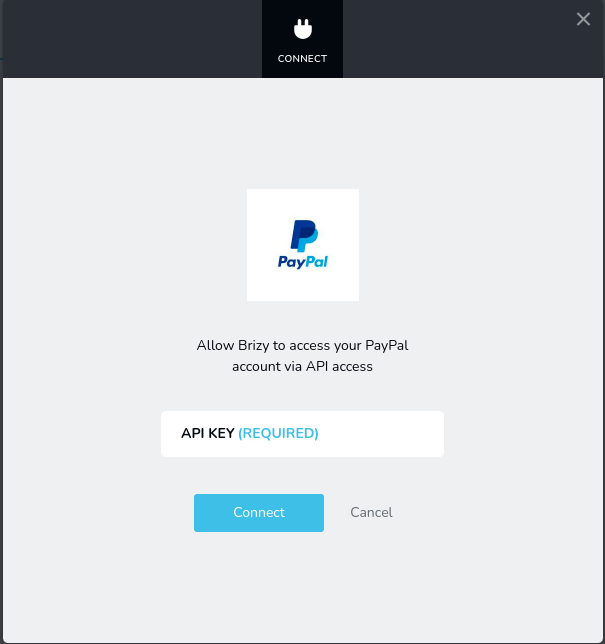
Example of the paypal connect popup:
Parameters
| Name | Type | Default | Description |
|---|---|---|---|
id | string | - | The identifier of the key where the paypal will save your data |
type | string | - | Type should be "paypal" to use this control |
label? | string | - | The label displayed on the left side of the control |
icon? | string | - | Icon name that will be rendered on left side of the control's label. View all icons. |
position? | number | - | The position of the control in toolbar |
roles? | Array<Role> | - | Render the control only if the current user's role matches one of the roles in the provided array. type Role = "admin" | "viewer" | "editor" | "designer" | "manager" |
devices? | "all" | "desktop" | "responsive" | "all" | Define the devices where the control will be rendered. "all" renders the control on all devices. "desktop" renders the control only on desktop devices. "responsive" renders the control on both tablet and mobile devices. |
disabled? | boolean | false | Configure the condition under which the control is disabled or enabled. |
display? | "inline" | "block" | "inline" | Configure how the control and its label will be arranged. If display is "inline" then label and control will be in one row, if display is "block" then label will be in one row, and the next row down will be the control. |
helper?.content | string | - | If provided, an icon is displayed next to the label. When hovering over this icon, a tooltip with additional information appears. |
helper?.position | "top-start" | "top" | "top-end" | "right-start" | "right" | "right-end" | "bottom-end" | "bottom" | "bottom-start" | "left-end" | "left" | "left-start" | "top" | Specifies the position of the tooltip relative to the helper icon. |
default? | Default | - | The default control value. Default: { value: string; } value - the control's custom initial value |
style? | function | - | This function generates CSS output based on the value from the control. The parameter is an object containing a value key, which holds the current value of the control. The function returns an object with a CSS selector key and CSS property values.
|
Basic example
Standard definition with only the required keys. This control will be visible on all devices.
{
  id: "account",
  type: "paypal"
}
Return value
The return value is a string representing the text field value, which is used to store the API key.
{
  value: string;
}
Example of value:
{
  value: "my-api-key"
}
Usage
Label example
Adding a label on the left side of the control.
{
  id: "account",
  type: "paypal",
  label: "Paypal"
}
Icon example
Adding a "paypal" icon to the left of the control's label.
{
  id: "account",
  type: "paypal",
  icon: "nc-paypal"
}
Roles example
Show the control only to users with admin and designer privileges.
{
  id: "account",
  type: "paypal",
  roles: ["admin", "designer"]
}
Devices examples
It will be rendered on all devices. This value can be omitted since it defaults to "all".
{
  id: "account",
  type: "paypal",
  devices: "all"
}
Rendering will occur only on desktop.
{
  id: "account",
  type: "paypal",
  devices: "desktop"
}
The display is limited to responsive modes, specifically tablet and mobile.
{
  id: "account",
  type: "paypal",
  devices: "responsive"
}
Disabled examples
Control will be disabled. Normally, here should be your dynamic condition.
{
  id: "account",
  type: "paypal",
  disabled: true
}
Control will be disabled when videoType variable will be "custom".
getValue is a getter function that allows us to retrieve the value of controls by their id.
"videoType" is the id of the "select" control below.
const getToolbarContols = ({ getValue }) => {
  const videoType = getValue("videoType");

  return [
    {
      id: "videoType",
      type: "select",
      choices: [
        { title: "Youtube", value: "youtube" },
        { title: "Custom", value: "custom" }
      ]
    },
    {
      id: "account",
      type: "paypal",
      disabled: videoType === "custom"
    }
  ]
}
Display examples
In this example, with display: "block", the label will be rendered on the first row and the control on the second.
{
  id: "account",
  type: "paypal",
  display: "block"
}
Helper examples
The helper object contains a content property with the value "help text", which will be displayed as additional guidance or information for the user.
{
  id: "account",
  type: "paypal",
  helper: {
    content: "help text"
  }
}
When the helper object contains a position property with the value "top-start", it indicates that the helper text will be displayed at the top left corner of the icon.
{
  id: "account",
  type: "paypal",
  helper: {
    content: "help text",
    position: "top-start"
  }
}
Default value examples��
In this example, the paypal control that has the value "my-custom-api-key" by default.
{
  id: "account",
  type: "paypal",
  default: {
    value: "my-custom-api-key"
  }
}
CSS examples
Change the color for the .brz-text element with CSS using a paypal control value.
{
  id: "account",
  type: "paypal",
  style: ({ value }) => {
    if (value.value && value.value.length) {
      return {
        "{{WRAPPER}} .brz-text": {
          color: "green"
        }
      }
    }

    return {
      "{{WRAPPER}} .brz-text": {
        color: "red"
      }
    }
  }
}
Usage in HTML example
In the example below, we use the paypal output value to determine the content in the text element.
import { Brizy } from "@brizy/core";
import React, { JSX } from "react";

interface Props {
  account: string;
}

const Text = (props: Props): JSX.Element => {
  const { account } = props;

  return (
    <div className="brz-text">
      <span>Your PayPal account is {account.length ? "connected" : "disconnected"}</span>
    </div>
  );
};

Brizy.registerComponent({
  id: "ThirdParty.Text",
  component: { editor: Text, view: Text },
  title: "My Text",
  category: "custom",
  options: (props) => {
    return [
      {
        selector: ".brz-text",
        toolbar: [
          {
            id: "toolbarCurrentElement",
            type: "popover",
            config: {
              icon: "nc-text",
              title: "Text"
            },
            devices: "desktop",
            options: [
              {
                id: "account",
                type: "paypal",
                devices: "desktop"
              }
            ]
          }
        ]
      }
    ]
  }
})