Motion
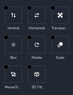
The motion control provides access to 8 predefined animations that are triggered when the page is scrolled. These animations include vertical movement, horizontal movement, transparency changes, blur effects, rotation, scaling, mouse tracking, and mouse tilting.
Example of the control:
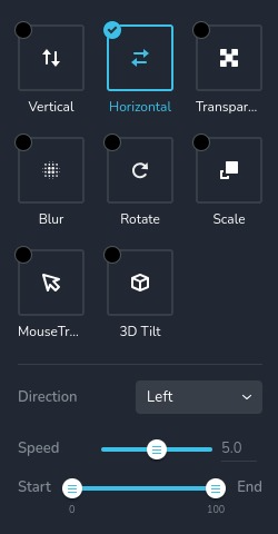
Example of the control with "horizontal" animation selected:
Parameters
| Name | Type | Default | Description |
|---|---|---|---|
id | string | - | The identifier of the key where the "motion" will save your data |
type | string | - | Type should be "motion" to use this control |
label? | string | - | The label displayed on the top side of the control |
className? | string | - | The custom CSS class name that will be set on the control. It can be used to modify the control styles. |
icon? | string | - | Icon name that will be rendered on left side of the control's label. View all icons. |
position? | number | - | The position of the control in toolbar |
roles? | Array<Role> | - | Render the control only if the current user's role matches one of the roles in the provided array. type Role = "admin" | "viewer" | "editor" | "designer" | "manager" |
devices? | "all" | "desktop" | "responsive" | "all" | Define the devices where the control will be rendered. "all" renders the control on all devices. "desktop" renders the control only on desktop devices. "responsive" renders the control on both tablet and mobile devices |
disabled? | boolean | false | Configure the condition under which the control is disabled or enabled |
helper?.content | string | - | If provided, displays an icon next to the label. When hovering over this icon, a tooltip with additional information appears |
helper?.position | "top-start" | "top" | "top-end" | "right-start" | "right" | "right-end" | "bottom-end" | "bottom" | "bottom-start" | "left-end" | "left" | "left-start" | "top" | Specifies the position of the tooltip relative to the helper icon |
config?.disabled | Array<Effect> | [ ] | An array of animation names that should be disabled. They will not disappear from the list, but they cannot be selected Effect = "vertical" | "horizontal" | "transparency" | "blur" | "rotate" | "scale" | "mouseTrack" | "mouseTilt" |
default? | Default | - | The default control value. Default: { active: Active; verticalEnabled: boolean; verticalSpeed: number; verticalDirection: string; verticalViewportType: string; verticalViewportTop: number; verticalViewportBottom: number; horizontalEnabled: boolean; horizontalSpeed: number; horizontalDirection: string; horizontalViewportType: string; horizontalViewportBottom: number; horiztontalViewportTop: number; rotateEnabled: boolean; rotateSpeed: number; rotateDirection: string; rotateX: string; rotateY: string; rotateViewportType: string; rotateViewportBottom: number; rotateViewportTop: number; transparencyEnabled: boolean; transparencyLevel: number; transparencyDirection: string; transparencyViewportType: string; transparencyViewportBottom: number; transparencyViewportTop: number; scaleEnabled: boolean; scaleSpeed: number; scaleDirection: string; scaleX: string; scaleY: string; scaleViewportType: string; scaleViewportBottom: number; scaleViewportTop: number; blurEnabled: boolean; blurLevel: number; blurDirection: string; blurViewportType: string; blurViewportBottom: number; blurViewportTop: number; mouseTrackEnabled: boolean; mouseTrackDirection: string; mouseTrackSpeed: number; mouseTiltEnabled: boolean; mouseTiltDirection: string; mouseTiltSpeed: number; } Active - indicates the currently selected motion, which can be "vertical", "horizontal", "transparency", "blur", "rotate", "scale", "mouseTrack", "mouseTilt" or undefined verticalEnabled- indicates enabled animation. verticalSpeed - indicates animation speed. verticalDirection- animation direction. verticalViewportType - Viewport type of animation. verticalViewportTop - animation minimum offset. verticalViewportBottom - animation maximum offset. horizontalEnabled- indicates enabled animation. horizontalSpeed - indicates animation speed. horizontalDirection- animation direction. horizontalViewportType - Viewport type of animation. horiztontalViewportTop - animation minimum offset. horizontalViewportType - animation maximum offset. rotateEnabled- indicates enabled animation. rotateEnabled - indicates animation speed. rotateDirection- animation direction. rotateX - angle for rotation around the X axis. rotateY - angle for rotation around the Y axis. rotateViewportType - Viewport type of animation. rotateViewportTop - animation minimum offset. rotateViewportType - animation maximum offset. transparencyEnabled- indicates enabled animation. transparencyLevel - indicates animation value. transparencyDirection- animation direction. transparencyViewportType - Viewport type of animation. transparencyViewportTop - animation minimum offset. transparencyViewportBottom - animation maximum offset. scaleEnabled- indicates enabled animation. scaleEnabled - indicates animation speed. scaleDirection- animation direction. scaleX - angle for scale around the X axis. scaleY - angle for scale around the Y axis. scaleViewportType - Viewport type of animation. scaleViewportTop - animation minimum offset. scaleViewportBottom - animation maximum offset. blurEnabled- indicates enabled animation. blurLevel - indicates animation value. blurDirection- animation direction. blurViewportType - Viewport type of animation. blurViewportTop - animation minimum offset. blurViewportBottom - animation maximum offset. mouseTrackEnabled- indicates enabled animation. mouseTrackSpeed - indicates animation speed. mouseTrackDirection- animation direction. mouseTiltEnabled- indicates enabled animation. mouseTiltSpeed - indicates animation speed. mouseTiltDirection- animation direction. |
style? | function | - | This function generates CSS output based on the value from the control. The parameter is an object containing a value key, which holds the current value of the control. The function returns an object with a CSS selector key and CSS property values.
|
Basic example
Standard definition with only the required keys. This control will be displayed on all devices.
{
  id: "motion",
  type: "motion"
}
Return value
Returns an object with the following values:
{
  active: undefined | "vertical" | "horizontal" | "transparency" | "blur" | "rotate" | "scale" | "mouseTrack" | "mouseTilt";
  vertical: undefined | { speed: number; direction: "up" | "down"; viewport: { bottom: number; top: number; type: "viewport"; } };
  horizontal: undefined | { speed: number; direction: "left" | "right"; viewport: { bottom: number; top: number; type: "viewport"; } };
  transparency: undefined | { direction: "in" | "out" | "outIn" | "inOut"; level: number; viewport: { bottom: number; top: number; type: "viewport"; } };
  blur: undefined | { direction: "in" | "out" | "outIn" | "inOut"; level: number; viewport: { bottom: number; top: number; type: "viewport"; } };
  rotate: undefined | { direction: "left" | "right"; x: "left" | "center" | "right"; y: "top" | "center" | "bottom"; speed: number; viewport: { bottom: number; top: number; type: "viewport"; } };
  scale: undefined | { direction: "up" | "down" | "downUp" | "upDown"; speed: number; x: "left" | "center" | "right"; y: "top" | "center" | "bottom"; viewport: { bottom: number; top: number; type: "viewport"; } };
  mouseTrack: undefined | { direction: "direct" | "opposite"; speed: number; };
  mouseTilt: undefined | { direction: "direct" | "opposite"; speed: number; };
}
active - indicates the currently selected animation;
All other object values are the animation names, which contain general parameters:
speed - the speed of the animation movement;
direction - the direction of the animation movement;
viewport - information about viewport: offset top and bottom;
level - indicates the effect (transparency, blur) strength;
x, y - indicates on which side of the axis the animation will start;
Example of value when the option "rotate" is selected:
{
  active: "rotate",
  mouseTiltEnabled: false,
  mouseTrackEnabled: false,
  rotateEnabled: true
}
When the settings of "rotate" are changed:
{
  rotateDirection: "right",
  rotateSpeed: 0.72,
  rotateViewportBottom: 1,
  rotateViewportTop: 0,
  rotateViewportType: "viewport",
  rotateX: "center",
  rotateY: "center"
}
Usage
Label example
Adds a label to the top of the list of animations.
{
  id: "motion",
  label: "Motion",
  type: "motion"
}
Class name example
Adding a CSS class to the control's DOM node.
{
  id: "motion",
  type: "motion",
  className: "myMotion"
}
Icon example
Adding a "star" icon to the left of the control's label.
{
  id: "motion",
  type: "motion",
  icon: "nc-star"
}
Roles example
Show the control only to users with admin and designer privileges.
{
  id: "motion",
  type: "motion",
  roles: ["admin", "designer"]
}
Devices examples
It will be rendered on all devices. This value can be skipped because it is set to "all" by default.
{
  id: "motion",
  type: "motion",
  devices: "all"
}
Rendering will occur only on desktop.
{
  id: "motion",
  type: "motion",
  devices: "desktop"
}
The display is limited to responsive modes, specifically tablet and mobile.
{
  id: "motion",
  type: "motion",
  devices: "responsive"
}
Disabled examples
Control will be disabled. Normally, here should be your dynamic condition.
{
  id: "motion",
  type: "motion",
  disabled: true
}
Control will be disabled when videoType variable will be "custom".
getValue is a getter function that allows us to retrieve the value of controls by their id.
"videoType" is the id of the "select" control below.
const getToolbarContols = ({ getValue }) => {
  const videoType = getValue("videoType");

  return [
    {
      id: "videoType",
      type: "select",
      choices: [
        { title: "Youtube", value: "youtube" },
        { title: "Custom", value: "custom" }
      ]
    },
    {
      id: "motion",
      type: "motion",
      disabled: videoType === "custom"
    }
  ]
}
Helper examples
The helper object contains a content property with the value "help text", which will be displayed as additional guidance or information for the user.
{
  id: "motion",
  type: "motion",
  helper: {
    content: "help text"
  }
}
When the helper object contains a position property with the value "top-start", it indicates that the helper text will be displayed in the top left corner of the icon.
{
  id: "motion",
  type: "motion",
  helper: {
    content: "help text",
    position: "top-start"
  }
}
Config disabled example
An array of animation names that should be disabled. In this case, you cannot select "vertical" and "scale" animations.
{
  id: "motion",
  type: "motion",
  config: {
    disabled: ["vertical", "scale"]
  }
}
Default value examples
In this example, the motion control provides extensive options for adding dynamic motion effects to elements.
Below is a detailed configuration object with all default values specified:
{
  id: "motion",
  type: "motion",
  default: {
    active: "rotate",
    verticalEnabled: false,
    verticalSpeed: 0.5,
    verticalSpeedSuffix: "",
    verticalDirection: "up",
    verticalViewportType: "viewport",
    verticalViewportTop: 0,
    verticalViewportBottom: 100,
    horizontalEnabled: false,
    horizontalSpeed: 0.5,
    horizontalSpeedSuffix: "",
    horizontalDirection: "left",
    horizontalViewportType: "viewport",
    horizontalViewportBottom: 100,
    horizontalViewportTop: 0,
    rotateEnabled: false,
    rotateSpeed: 0.5,
    rotateSpeedSuffix: "",
    rotateDirection: "left",
    rotateX: "center",
    rotateY: "center",
    rotateViewportType: "viewport",
    rotateViewportBottom: 100,
    rotateViewportTop: 0,
    transparencyEnabled: false,
    transparencyLevel: 0.5,
    transparencyLevelSuffix: "",
    transparencyDirection: "in",
    transparencyViewportType: "viewport",
    transparencyViewportBottom: 100,
    transparencyViewportTop: 0,
    scaleEnabled: false,
    scaleSpeed: 10,
    scaleSpeedSuffix: "",
    scaleDirection: "up",
    scaleX: "center",
    scaleY: "center",
    scaleViewportType: "viewport",
    scaleViewportBottom: 100,
    scaleViewportTop: 0,
    blurEnabled: false,
    blurLevel: 0.5,
    blurLevelSuffix: "",
    blurDirection: "in",
    blurViewportType: "viewport",
    blurViewportBottom: 100,
    blurViewportTop: 0,
    mouseTrackEnabled: false,
    mouseTrackDirection: "direct",
    mouseTrackSpeed: 0.25,
    mouseTrackSpeedSuffix: "",
    mouseTiltEnabled: false,
    mouseTiltDirection: "direct",
    mouseTiltSpeed: 0.25,
    mouseTiltSpeedSuffix: ""
  }
}
CSS examples
This example will change the transform of .brz-text and .brz-box elements based on the motion control values.
If horizontal motion is enabled and its speed is greater than or equal to 0.5, the .brz-text element will translate
horizontally by that speed value multiplied by 10 pixels.
If vertical motion is enabled and its speed is greater than or equal to 0.5, the .brz-box element will translate
vertically by that speed value multiplied by 10 pixels.
Also, if transparency level >= 0.5, then we will set .brz-box element to display "flex",
otherwise it will be displayed "none";
{
  id: "motion",
  type: "motion",
  style: ({ value }) => {
    const display = value?.transparency?.level >= 0.5 ? "flex" : "none";

    const horizontalTranslate = value?.horizontal?.enabled && value?.horizontal?.speed >= 0.5
      ? `translateX(${value.horizontal.speed * 10}px)`
      : "translateX(0)";

    const verticalTranslate = value?.vertical?.enabled && value?.vertical?.speed >= 0.5
      ? `translateY(${value.vertical.speed * 10}px)`
      : "translateY(0)";

    return {
      "{{WRAPPER}} .brz-text": {
        transform: horizontalTranslate,
      },
      "{{WRAPPER}} .brz-box": {
        transform: verticalTranslate,
        display
      }
    }
  }
}
Usage in HTML example
In this example, we demonstrate the use of motion control values (horizontal and rotate) to dynamically transform and
control a carousel component's behavior. The Carousel component reacts to changes in motion settings to adjust
its display, offering a dynamic user experience.
This example demonstrates how motion control values can be utilized to create dynamic and responsive user interfaces,
enhancing the user experience by adjusting visual elements based on user-defined motion settings.
import { Brizy } from "@brizy/core";
import React, { JSX } from "react";

interface Props {
  active: undefined | "vertical" | "horizontal" | "transparency" | "blur" | "rotate" | "scale" | "mouseTrack" | "mouseTilt",
  carouselVerticalEnabled: boolean,
  carouselVerticalSpeed: number,
  carouselVerticalSpeedSuffix: string,
  carouselVerticalDirection: "up" | "down",
  carouselVerticalViewportType: "viewport",
  carouselVerticalViewportTop: number,
  carouselVerticalViewportBottom: number,
  carouselHorizontalEnabled: boolean,
  carouselHorizontalSpeed: number,
  carouselHorizontalSpeedSuffix: string,
  carouselHorizontalDirection: "left" | "right",
  carouselHorizontalViewportType: "viewport",
  carouselHorizontalViewportBottom: number,
  carouselHorizontalViewportTop: number,
  carouselRotateEnabled: boolean,
  carouselRotateSpeed: number,
  carouselRotateSpeedSuffix: string,
  carouselRotateDirection: "left" | "right",
  carouselRrotateX: "left" | "center" | "right",
  carouselRotateY: "top" | "center" | "bottom",
  carouselRotateViewportType: "viewport",
  carouselRotateViewportBottom: number,
  carouselRotateViewportTop: number,
  carouselTransparencyEnabled: boolean,
  carouselTransparencyLevel: number,
  carouselTransparencyLevelSuffix: string,
  carouselTransparencyDirection: "in" | "out" | "outIn" | "inOut",
  carouselTransparencyViewportType: "viewport",
  carouselTransparencyViewportBottom: number,
  carouselTransparencyViewportTop: number,
  carouselScaleEnabled: boolean,
  carouselScaleSpeed: number,
  carouselScaleSpeedSuffix: string,
  carouselScaleDirection: "up" | "down" | "downUp" | "upDown",
  carouselScaleX: "left" | "center" | "right",
  carouselScaleY: "top" | "center" | "bottom",
  carouselScaleViewportType: "viewport",
  carouselScaleViewportBottom: number,
  carouselScaleViewportTop: number,
  carouselBlurEnabled: boolean,
  carouselBlurLevel: number,
  carouselBlurLevelSuffix: string,
  carouselBlurDirection: "in" | "out" | "outIn" | "inOut",
  carouselBlurViewportType: "viewport",
  carouselBlurViewportBottom: number,
  carouselBlurViewportTop: number,
  carouselMouseTrackEnabled: boolean,
  carouselMouseTrackDirection: "direct" | "opposite",
  carouselMouseTrackSpeed: number,
  carouselMouseTrackSpeedSuffix: string,
  carouselMouseTiltEnabled: boolean,
  carouselMouseTiltDirection: "direct" | "opposite",
  carouselMouseTiltSpeed: number,
  carouselMouseTiltSpeedSuffix: string
}

const Carousel = (props: Props): JSX.Element => {
  const { active, carouselRotateSpeed, carouselRotateDirection, carouselHorizontalSpeed, carouselHorizontalDirection } = props;

  const calculateRotation = (speed?: number, direction?: "left" | "right") => {
    if (speed && direction) {
      return `rotate${direction === "left" ? "-" : ""}${speed}deg`;
    }
    return "rotate(0deg)";
  };

  const calculateTranslateX = (speed?: number, direction?: "left" | "right") => {
    if (speed && direction) {
      return `translateX(${direction === "left" ? "-" : ""}${speed * 10}px)`;
    }
    return "translateX(0)";
  };

  const renderCarouselContent = () => {
    switch (active) {
      case "rotate":
        return (
          <div className="brz-carousel-item" style={{ transform: calculateRotation(carouselRotateSpeed, carouselRotateDirection) }}>
            <img src="carousel-image.jpg" alt="Carousel Image" />
          </div>
        );
      case "horizontal":
        return (
          <div className="brz-carousel-item" style={{ transform: calculateTranslateX(carouselHorizontalSpeed, carouselHorizontalDirection) }}>
            <img src="carousel-image.jpg" alt="Carousel Image" />
          </div>
        );
      default:
        return null;
    }
  };

  return (
    <div className="brz-carousel">
      {renderCarouselContent()}
    </div>
  );
};

Brizy.registerComponent({
  id: "ThirdParty.Carousel",
  component: { editor: Carousel, view: Carousel },
  title: "My Carousel",
  category: "custom",
  options: (props) => {
    return [
      {
        selector: ".brz-сarousel",
        toolbar: [
          {
            id: "toolbarSettings",
            type: "popover",
            config: {
              icon: "nc-cog",
              title: "Settings"
            },
            options: [
              {
                id: "carousel",
                type: "motion",
                devices: "desktop"
              }
            ]
          }
        ]
      }
    ];
  }
});