Image Upload
The imageUpload control displays a image selection interface, enabling the user to choose one image from their device storage.
Example of the imageUpload control:

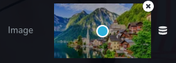
Example of uploaded image in control:
Example of uploaded image without the possibility to delete it:
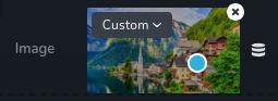
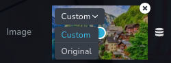
Example of a dropdown menu for selecting image sizes:
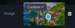
Example of uploaded image without sizes dropdown:
Parameters
| Name | Type | Default | Description |
|---|---|---|---|
id | string | - | The identifier of the key where the imageUpload will save your data |
type | string | - | Type should be "imageUpload" to use this control |
label? | string | - | The label displayed on the left side of the control |
position? | number | - | The position of the control in toolbar |
icon? | string | - | Icon name that will be rendered on left side of the control's label. View all icons. |
roles? | Array<Role> | - | Render the control only if the current user's role matches one of the roles in the provided array. type Role = "admin" | "viewer" | "editor" | "designer" | "manager" |
devices? | "all" | "desktop" | "responsive" | "all" | Define the devices where the control will be rendered. "all" renders the control on all devices. "desktop" renders the control only on desktop devices. "responsive" renders the control on both tablet and mobile devices. |
disabled? | boolean | false | Configure the condition under which the control is disabled or enabled. |
display? | "inline" | "block" | "inline" | Configure how the control and its label will be arranged. If display is "inline" then label and control will be in one row, if display is "block" then label will be in one row, and the next row down will be the control. |
helper?.content | string | - | If provided, displays an icon next to the label. When hovering over this icon, a tooltip with additional information appears |
helper?.position | "top-start" | "top" | "top-end" | "right-start" | "right" | "right-end" | "bottom-end" | "bottom" | "bottom-start" | "left-end" | "left" | "left-start" | "top" | Specifies the position of the tooltip relative to the helper icon |
states? | Array<State> | ["normal"] | Allows for different styles based on the element's state State = "normal" | "hover" | "active" "normal" - the normal state of an element, "hover" - the state when the element is hovered over, "active" - the state when the element is active (e.g., current page in pagination) |
config?.pointer | boolean | true | The pointer you see after adding an image serves as a visual indicator for determining the center of the image. By moving this pointer, you can accurately select where you want the center of the image to be positioned. This feature allows you to precisely align and position the image within the frame or designated area, ensuring it is perfectly centered according to your preferences. |
config?.edit | boolean | true | Deactivate the possibility to delete an uploaded photo. |
config?.disableSizes | boolean | false | This is used to enable or disable a dropdown menu (top left corner) for selecting image sizes related to an uploaded image. |
config?.acceptedExtensions | Array<Extensions> | - | Specifies the accepted image extensions. Extensions = "svg" | "png" | "jpg" | "jpeg" | "gif" | "webp" |
default? | Default | - | The default control value. Default: { imageSrc: string; imageFileName:string; imageExtension: string; imageWidth: number; imageHeight: number; imageType: "internal" | "external" | "unsplash"; sizeType: "original" | "custom"; positionX: number; positionY:number; } imageSrc- specifies the full path to the asset, including the directory structure where the image is stored. imageFileName - denotes the name of the asset file, providing a unique identifier for the image within its directory. imageExtension - indicates the file format of the asset, such as .svg, .png, .gif and others, determining how the image is encoded. imageWidth - represents the width of the asset in pixels, defining the horizontal dimension of the image. imageHeight - represents the height of the asset in pixels, defining the vertical dimension of the image. imageType - describes the source of the asset, which can be one of three types: "internal" for images stored within the project's assets, "external" for images hosted on external websites, or "unsplash" for images sourced from the Unsplash platform. |
style? | function | - | This function generates CSS output based on the value from the control. The parameter is an object containing a value key, which holds the current value of the control. The function returns an object with a CSS selector key and CSS property values.
|
Basic example
Standard definition with only the required keys. This control will be visible on all devices.
{
  id: "image",
  type: "imageUpload"
}
Return value
Returns an object with the following values:
{
  imageSrc: string;
  imageFileName: string;
  imageExtension: string;
  imageWidth: number;
  imageHeight: number;
  imageType: "internal" | "external" | "unsplash";
  sizeType: "original" | "custom";
  positionX: number;
  positionY: number;
}
imageSrc- specifies the full path to the asset, including the directory structure where the image is stored.
imageFileName - denotes the name of the asset file, providing a unique identifier for the image within its directory.
imageExtension - indicates the file format of the asset, such as .svg, .png, .gif and others, determining how the image is encoded.
imageWidth - represents the width of the asset in pixels, defining the horizontal dimension of the image.
imageHeight - represents the height of the asset in pixels, defining the vertical dimension of the image.
imageType - describes the source of the asset, which can be one of three types: "internal" for images stored within the project's assets, "external" for images hosted on external websites, or "unsplash" for images sourced from the Unsplash platform.
sizeType - specifies the size of the image, which can be either "original" for the image's original size or "custom" for a custom size.
positionX - represents the horizontal position of the image in percentage, indicating the asset's location along the x-axis.
positionY - represents the vertical position of the image in percentage, indicating the asset's location along the y-axis.
Example of value:
{
  "imageSrc": "439ee0419a62ea8bb4ea9c9c65534808.svg",
  "imageFileName": "circle-outline.svg",
  "imageExtension": "svg",
  "imageWidth": 800,
  "imageHeight": 800,
  "imageType": "internal",
  "sizeType": "original",
  "positionX": 50,
  "positionY": 50
}
Usage
Label example
Adding a label on the left side of the control.
{
  id: "image",
  type: "imageUpload",
  label: "Asset"
}
Icon example
Adding a "image" icon to the left of the control's label.
{
  id: "image",
  type: "imageUpload",
  icon: "nc-image"
}
Roles example
Show the control only to users with admin and designer privileges.
{
  id: "image",
  type: "imageUpload",
  roles: ["admin", "designer"]
}
Devices examples
It will be rendered on all devices. This value can be omitted since it defaults to "all".
{
  id: "image",
  type: "imageUpload",
  devices: "all"
}
Rendering will occur only on desktop.
{
  id: "image",
  type: "imageUpload",
  devices: "desktop"
}
The display is limited to responsive modes, specifically tablet and mobile.
{
  id: "image",
  type: "imageUpload",
  devices: "responsive"
}
Disabled examples
Control will be disabled. Normally, here should be your dynamic condition.
{
  id: "image",
  type: "imageUpload",
  disabled: true
}
Control will be disabled when videoType variable will be "custom".
getValue is a getter function that allows us to retrieve the value of controls by their id.
"videoType" is the id of the "select" control below.
const getToolbarContols = ({ getValue }) => {
  const videoType = getValue("videoType");

  return [
    {
      id: "videoType",
      type: "select",
      choices: [
        { title: "Youtube", value: "youtube" },
        { title: "Custom", value: "custom" }
      ]
    },
    {
      id: "image",
      type: "imageUpload",
      disabled: videoType === "custom"
    }
  ];
};
Display examples
In this example, with display: "block", the label will be rendered on the first row and the control on the second.
{
  id: "image",
  type: "imageUpload",
  display: "block"
}
Helper examples
The helper object contains a content property with the value "help text", which will be displayed as additional guidance or information for the user.
{
  id: "image",
  type: "imageUpload",
  helper: {
    content: "help text"
  }
}
When the helper object contains a position property with the value "top-start", it indicates that the helper text will be displayed at the top left corner of the icon.
{
  id: "image",
  type: "imageUpload",
  helper: {
    content: "help text",
    position: "top-start"
  }
}
States example
Allows the control to work in normal and hover states.
{
  id: "image",
  type: "imageUpload",
  states: ["normal", "hover"]
}
Allows the control to work in normal, hover and active states.
{
  id: "image",
  type: "imageUpload",
  states: ["normal", "hover", "active"]
}
Config pointer examples
The config object has a pointer property set to false. This property will not display the pointer from the uploaded image and will not allow you to locate the center of the asset.
{
  id: "image",
  type: "imageUpload",
  config: {
    pointer: false
  }
}
Config edit examples
The config object has an edit property set to false. This setting will not allow you to delete uploaded asset.
{
  id: "image",
  type: "imageUpload",
  config: {
    edit: false
  }
}
Config disableSizes examples
The config object has the disableSizes property set to true, so the top-left dropdown will not be visible.
{
  id: "image",
  type: "imageUpload",
  config: {
    disableSizes: true
  }
}
Config acceptedExtensions examples
The acceptedExtensions property set to ["svg", "png"] means that we can upload only ".svg" or ".png" files.
{
  id: "image",
  type: "imageUpload",
  config: {
    acceptedExtensions: ["svg", "png"]
  }
}
Default value examples
In this example, the imageUpload will have as default value the object below.
{
  id: "image",
  type: "imageUpload",
  default: {
    imageWidth: 800,
    imageHeight: 800,
    imageExtension: "png",
    imageFileName: "",
    imageSrc: "",
    imageType: "internal",
    sizeType: "original",
    positionX: 50,
    positionY: 50
  }
}
Style example
Set the width and height of the .brz-image element based on the value of the control.
{
  id: "image",
  type: "imageUpload",
  style: ({ value }) => ({
    "{{WRAPPER}} .brz-image": {
      width: value.imageWidth,
      height: value.imageHeight
    }
  })
}
Usage in HTML example
In this example, the value of the control is used to display the uploaded image in the HTML.
import { Brizy } from "@brizy/core";
import React, { JSX } from "react";

interface Props {
  imageImageSrc: string;
  imageImageFileName: string;
  imageImageWidth: number;
  imageImageHeight: number;
}

const Image = (props: Props): JSX.Element => {
  const { imageImageSrc, imageImageFileName, imageImageWidth, imageImageHeight } = props;

  return (
    <div className="brz-img">
      <img src={imageImageSrc} alt={imageImageFileName} width={imageImageWidth} height={imageImageHeight} />
    </div>
  );
};

Brizy.registerComponent({
  id: "ThirdParty.Image",
  component: { editor: Image, view: Image },
  title: "My Image",
  category: "custom",
  options: (props) => {
    return [
      {
        selector: ".brz-img",
        toolbar: [
          {
            id: "toolbarCurrentElement",
            type: "popover",
            options: [
              {
                id: "image",
                type: "imageUpload"
              }
            ]
          }
        ]
      }
    ];
  }
});