圖片上傳
imageUpload 控制項顯示一個圖片選擇界面,讓使用者從其裝置存儲中選擇一張圖片。
imageUpload 控制項範例:

控制項中上傳的圖片範例:
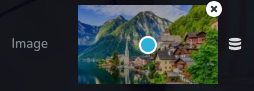
無法刪除上傳圖片的範例:
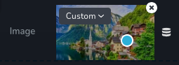
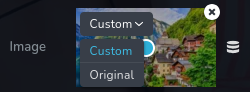
選擇圖片尺寸的下拉選單範例:
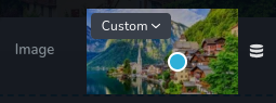
無尺寸選單的上傳圖片範例:
參數
| 名稱 | 類型 | 預設值 | 說明 |
|---|---|---|---|
id | string | - | imageUpload 將保存資料的鍵的識別碼 |
type | string | - | 類型應設為 "imageUpload" 以使用此控制項 |
label? | string | - | 顯示在控制項左側的標籤 |
position? | number | - | 控制項在工具列中的位置 |
icon? | string | - | 將在控制項標籤左側顯示的圖標名稱。查看所有圖標。 |
roles? | Array<Role> | - | 僅當目前使用者的角色符合提供的角色陣列中的某個角色時才渲染控制項。 type Role = "admin" | "viewer" | "editor" | "designer" | "manager" |
devices? | "all" | "desktop" | "responsive" | "all" | 定義控制項將在哪些裝置上渲染。"all" 在所有裝置上渲染控制項,"desktop" 只在桌面裝置上渲染控制項,"responsive" 在平板和手機裝置上渲染控制項。 |
disabled? | boolean | false | 配置控制項在什麼情況下會被禁用或啟用。 |
display? | "inline" | "block" | "inline" | 配置控制項及其標籤的排列方式。如果 display 設為 "inline",標籤和控制項會排在同一行;如果設為 "block",標籤會位於第一行,而控制項會在下一行顯示。 |
helper?.content | string | - | 如果提供,則會在標籤旁顯示一個圖標。當滑鼠懸停在該圖標上時,將顯示額外資訊的工具提示 |
helper?.position | "top-start" | "top" | "top-end" | "right-start" | "right" | "right-end" | "bottom-end" | "bottom" | "bottom-start" | "left-end" | "left" | "left-start" | "top" | 指定工具提示相對於輔助圖標的位置 |
states? | Array<State> | ["normal"] | 允許根據元素的狀態設置不同樣式 State = "normal" | "hover" | "active" "normal" - 元素的正常狀態,"hover" - 元素被滑鼠懸停時的狀態,"active" - 元素處於活動狀態(例如,分頁中當前頁面) |
config?.pointer | boolean | true | 添加圖片後看到的指針作為一個視覺指示器,用於確定圖片的中心位置。通過移動此指針,您可以準確選擇希望圖片中心的位置。此功能允許您精確對齊和定位圖片,使其在框架或指定區域內完美居中,根據您的喜好進行精確調整。 |
config?.edit | boolean | true | 停用刪除已上傳圖片的功能。 |
config?.disableSizes | boolean | false | 用於啟用或禁用下拉選單(左上角),以選擇與上傳圖片相關的圖片尺寸。 |
config?.acceptedExtensions | Array<Extensions> | - | 指定接受的圖片擴展名。 擴展名 = "svg" | "png" | "jpg" | "jpeg" | "gif" | "webp" |
default? | 預設值 | - | 預設控制值。預設值: { imageSrc: string; imageFileName:string; imageExtension: string; imageWidth: number; imageHeight: number; imageType: "internal" | "external" | "unsplash"; sizeType: "original" | "custom"; positionX: number; positionY:number; } imageSrc - 指定資源的完整路徑,包括儲存圖像的目錄結構。imageFileName - 表示資源文件的名稱,為圖像提供目錄中的唯一標識符。imageExtension - 指示資源的文件格式,如 .svg、.png、.gif 等,決定圖像的編碼方式。imageWidth - 表示資源的寬度(以像素為單位),定義圖像的水平尺寸。imageHeight - 表示資源的高度(以像素為單位),定義圖像的垂直尺寸。imageType - 描述資源的來源,可以是三種類型之一: "internal" 代表存儲在項目資源中的圖像,"external" 代表托管在外部網站上的圖像,或 "unsplash" 代表來自 Unsplash 平台的圖像。 |
基本範例
只包含必要鍵值的標準定義。此控制項將顯示在所有設備上。
{
  id: "image",
  type: "imageUpload"
}
返回值
返回一個包含以下值的物件:
{
  imageSrc: string;
  imageFileName: string;
  imageExtension: string;
  imageWidth: number;
  imageHeight: number;
  imageType: "internal" | "external" | "unsplash";
  sizeType: "original" | "custom";
  positionX: number;
  positionY: number;
}
imageSrc - 指定資產的完整路徑,包括圖像存儲的目錄結構。
imageFileName - 表示資產文件的名稱,提供該圖像在其目錄中的唯一識別符。
imageExtension - 指示資產的文件格式,例如 .svg、.png、.gif 等,決定圖像的編碼方式。
imageWidth - 表示資產的寬度(以像素為單位),定義圖像的橫向尺寸。
imageHeight - 表示資產的高度(以像素為單位),定義圖像的縱向尺寸。
imageType - 描述資產的來源,可以是三種類型之一:"internal" 表示存儲在專案資產中的圖像,"external" 表示託管在外部網站上的圖像,或者 "unsplash" 表示來自 Unsplash 平台的圖像。
sizeType - 指定圖像的大小,可以是 "original" 表示圖像的原始大小,或 "custom" 表示自定義大小。
positionX - 表示圖像在水平位置上的百分比,指示資產在 x 軸上的位置。
positionY - 表示圖像在��垂直位置上的百分比,指示資產在 y 軸上的位置。
範例值:
{
  "imageSrc": "439ee0419a62ea8bb4ea9c9c65534808.svg",
  "imageFileName": "circle-outline.svg",
  "imageExtension": "svg",
  "imageWidth": 800,
  "imageHeight": 800,
  "imageType": "internal",
  "sizeType": "original",
  "positionX": 50,
  "positionY": 50
}
使用方法
標籤範例
在控制項左側新增標籤。
{
  id: "image",
  type: "imageUpload",
  label: "Asset"
}
圖示範例
在控制項標籤左側新增一個 "image" 圖示。
{
  id: "image",
  type: "imageUpload",
  icon: "nc-image"
}
角色範例
僅對具有 admin 和 designer 權限的用戶顯示控制項。
{
  id: "image",
  type: "imageUpload",
  roles: ["admin", "designer"]
}
設備範例
將在所有設備上顯示。此值可以省略,因為預設值為 "all"。
{
  id: "image",
  type: "imageUpload",
  devices: "all"
}
僅在 desktop 上顯示。
{
  id: "image",
  type: "imageUpload",
  devices: "desktop"
}
顯示僅限於響應模式,特定於 tablet 和 mobile。
{
  id: "image",
  type: "imageUpload",
  devices: "responsive"
}
禁用範例
控制項將被禁用。通常,此處應該是您的動態條件。
{
  id: "image",
  type: "imageUpload",
  disabled: true
}
當 videoType 變數為 "custom" 時,控制項將被禁用。
getValue 是一個 getter 函數,允許我們通過控制項的 id 獲取其值。
"videoType" 是下面 "select" 控制項的 id。
const getToolbarContols = ({ getValue }) => {
  const videoType = getValue("videoType");

  return [
    {
      id: "videoType",
      type: "select",
      choices: [
        { title: "Youtube", value: "youtube" },
        { title: "Custom", value: "custom" },
      ],
    },
    {
      id: "image",
      type: "imageUpload",
      disabled: videoType === "custom",
    },
  ];
};
顯示範例
在此範例中,使用 display: "block" 時,標籤將顯示在第一行,而控制項將顯示在第二行。
{
  id: "image",
  type: "imageUpload",
  display: "block"
}
幫助範例
幫助物件包含一個內容屬性,值為 "help text",將顯示為對用戶的額外指導或資訊。
{
  id: "image",
  type: "imageUpload",
  helper: {
    content: "help text"
  }
}
當幫助物件包含位置屬性且值為 "top-start" 時,表示幫助文字將顯示在圖示的左上角。
{
  id: "image",
  type: "imageUpload",
  helper: {
    content: "help text",
    position: "top-start"
  }
}
狀態範例
允許控制項在正常和懸停狀態下運作。
{
  id: "image",
  type: "imageUpload",
  states: ["normal", "hover"]
}
允許控制項在正常、懸停和啟用狀態下運作。
{
  id: "image",
  type: "imageUpload",
  states: ["normal", "hover", "active"]
}
配置 pointer 範例
配置物件有一個 pointer 屬性設置為 false。此屬性將不會顯示來自上傳圖像的指針,也不允許您定位資��產的中心。
{
  id: "image",
  type: "imageUpload",
  config: {
    pointer: false
  }
}
配置 edit 範例
配置物件有一個 edit 屬性設置為 false。此設置將不允許您刪除已上傳的資產。
{
  id: "image",
  type: "imageUpload",
  config: {
    edit: false
  }
}
配置 disableSizes 範例
配置物件有 disableSizes 屬性設置為 true,因此左上角的下拉選單將不可見。
{
  id: "image",
  type: "imageUpload",
  config: {
    disableSizes: true
  }
}
配置 acceptedExtensions 範例
acceptedExtensions 屬性設置為 ["svg", "png"],意味著我們只能上傳 .svg 或 .png 文件。
{
  id: "image",
  type: "imageUpload",
  config: {
    acceptedExtensions: ["svg", "png"]
  }
}
預設值範例
在此範例中,imageUpload 將具有以下物件作為預設值。
{
  id: "image",
  type: "imageUpload",
  default: {
    imageWidth: 800,
    imageHeight: 800,
    imageExtension: "png",
    imageFileName: "",
    imageSrc: "",
    imageType: "internal",
    sizeType: "original",
    positionX: 50,
    positionY: 50
  }
}
樣式範例
根據控制項的值設置 .brz-image 元素的寬度和高度。
{
  id: "image",
  type: "imageUpload",
  style: ({ value }) => ({
    "{{WRAPPER}} .brz-image": {
      width: value.imageWidth,
      height: value.imageHeight
    }
  })
}
在 HTML 中的使用範例
在此範例中,控制項的值用於在 HTML 中顯示已上傳的圖像。
import { Brizy } from "@brizy/core";
import React, { JSX } from "react";

interface Props {
  imageImageSrc: string;
  imageImageFileName: string;
  imageImageWidth: number;
  imageImageHeight: number;
}

const Image = (props: Props): JSX.Element => {
  const { imageImageSrc, imageImageFileName, imageImageWidth, imageImageHeight } = props;

  return (
    <div className="brz-img">
      <img src={imageImageSrc} alt={imageImageFileName} width={imageImageWidth} height={imageImageHeight} />
    </div>
  );
};

Brizy.registerComponent({
  id: "ThirdParty.Image",
  component: { editor: Image, view: Image },
  title: "My Image",
  category: "custom",
  options: (props) => {
    return [
      {
        selector: ".brz-img",
        toolbar: [
          {
            id: "toolbarCurrentElement",
            type: "popover",
            options: [
              {
                id: "image",
                type: "imageUpload",
              },
            ],
          },
        ],
      },
    ];
  },
});