內部連結
Brizy 的 internalLink 控制項讓你輕鬆地將使用者重新導向到網站內的任何頁面。此功能提升了導航體驗,通過無縫引導訪客到相關內容或重要部分,改善了使用者體驗。
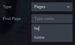
internalLink 的範例:

internalLink 搜尋範例:

internalLink 結果範例:
參數
| 名稱 | 類型 | 預設值 | 描述 |
| :-------------------- | :----------------------------------------------------------------------------------------------------------------------------------------------------------------------------------------- | :----------: | :------------------------------------------------------------------------------------------------------------------------------------------------------------------------------------------------------------------------------------------------------------------------------------------------------------------------------ | --- |
| id | string | - | internalLink 儲存資料的鍵的識別碼 |
| type | string | - | 類型應設為 "internalLink" 以使用此控制項 |
| placeholder? | string | - | 輸入框中顯示的佔位符文字。 |
| label? | string | - | 控制項左側顯示的標籤 |
| className? | string | - | 將設定在控制項上的自訂 CSS 類別名稱。可用來修改控制項的樣式。 |
| icon? | string | - | 顯示在控制項標籤左側的圖示名稱。查看所有 圖示。 |
| position? | number | - | 控制項在工具列中的位置 |
| devices? | "all" | "desktop" | "responsive" | "all" | 定義控制項將在哪些裝置上渲染。"all" 會在所有裝置上渲染控制項。"desktop" 只會在桌面裝置上渲染控制項。"responsive" 會在平板和行動裝置上渲染控制項。 |
| roles? | Array<Role> | - | 僅在當前使用者的角色符合提供的角色陣列中的其中一個時才渲染控制項。
type Role = "admin" \| "viewer" \| "editor" \| "designer" \| "manager" | |
| states? | Array<State> | ["normal"] | 允許根據元素的狀態應用不同的樣式
State = "normal" \| "hover" \| "active"
"normal" - 元素的正常狀態,
"hover" - 當元素被滑鼠懸停時的狀態,
"active" - 當元素處於活躍狀態時(例如,分頁中的當前頁面) |
| disabled? | boolean | false | 配置控制項在何種條件下被禁用或啟用。 |
| helper?.content | string | - | 如果提供,將在標籤旁顯示一個圖示。當懸停在此圖示上時,會顯示包含額外資訊的工具提示。 |
| helper?.position | "top-start" | "top" | "top-end" | "right-start" | "right" | "right-end" | "bottom-end" | "bottom" | "bottom-start" | "left-end" | "left" | "left-start" | "top" | 指定工具提示相對於輔助圖示的位置。 |
| config?.sourceLabel | string | "Type" | 顯示在控制項左側的第一個選擇標籤。 |
| default? | Default | - | 控制項的預設值。
Default: { value: string; title: string; source: string; }
value - 控制項的自訂初始值
title - 選擇值的標籤。
source - 嘗試尋找連結的集合。這表示用於定位和檢索選擇值及其對應標籤的數據集或集合。 |
| style? | function | - | 此函數根據控制項的值生成 CSS 輸出。參數是一個包含 value 鍵的對象,該鍵保存控制項的當前值。函數返回一個對象,其中包含 CSS 選擇器鍵和 CSS 屬性值。
|style: ({value}) => {
return {
"{{WRAPPER}} .brz-text": {
"text-decoration": value.value ? "underline" : "none"
}
}}
基本範例
標準定義,僅包含所需的鍵。此控制項將顯示在所有裝置上。
{
  id: "link",
  type: "internalLink"
}
返回值
返回一個包含以下值的對象:
{
  value: string;
  title: string;
  source: string;
}
value - 實際選擇的值。
title - 選擇值的標籤。
source - 嘗試尋找連結的集合。這表示用於定位和檢索選擇值及其對應標籤的數據集或集合。
返回值範例:
{
  value: "/about",
  title: "About",
  source: "pages"
}
使用方法
佔位符範例
為控制項添加佔位符文字。
{
  id: "link",
  type: "internalLink",
  placeholder: "Find page"
}
標籤範例
在控制項左側添加標籤。
{
  id: "link",
  label: "Redirect",
  type: "internalLink"
}
類別名稱範例
為控制項的 DOM 節點添加 CSS 類別。
{
  id: "link",
  type: "internalLink",
  className: "internal-link"
}
圖示範例
在控制項標籤的左側添加 "link" 圖示。
{
  id: "link",
  type: "internalLink",
  icon: "nc-link"
}
裝置範例
將在所有裝置上渲染。此值可以省略,因為預設為 "all"。
{
  id: "link",
  type: "internalLink",
  devices: "all"
}
僅在 desktop 裝置上渲染。
{
  id: "link",
  type: "internalLink",
  devices: "desktop"
}
顯示限制為響應模式,具體為 tablet 和 mobile。
{
  id: "link",
  type: "internalLink",
  devices: "responsive"
}
角色範例
僅對具有 admin 和 designer 權限的使用者顯示控制項。
{
  id: "link",
  type: "internalLink",
  roles: ["admin", "designer"]
}
狀態範例
允許控制項在正常和懸停狀態下工作。
{
  id: "link",
  type: "internalLink",
  states: ["normal", "hover"]
}
允許控制項在正常、懸停和活躍狀態下工作。
{
  id: "link",
  type: "internalLink",
  states: ["normal", "hover", "active"]
}
禁用範例
控制項將被禁用。通常,這裡應是你的動態條件。
{
  id: "link",
  type: "internalLink",
  disabled: true
}
當 videoType 變數為 "custom" 時,控制項將被禁用。
getValue 是一個 getter 函數,允許我們通過 ID 獲取控制項的值。
"videoType" 是下面 "select" 控制項的 ID。
const getToolbarContols = ({ getValue }) => {
  const videoType = getValue("videoType");

  return [
    {
      id: "videoType",
      type: "select",
      choices: [
        { title: "Youtube", value: "youtube" },
        { title: "Custom", value: "custom" },
      ],
    },
    {
      id: "link",
      type: "internalLink",
      disabled: videoType === "custom",
    },
  ];
};
輔助範例
輔助包含一個內容屬性,其值為 "help text",這將顯示為對使用者的額外指導或信息。
{
  id: "link",
  type: "internalLink",
  config: {
    helper: "help text"
  }
}
當輔助對象包含位置屬性,其值為 "top-end" 時,表示輔助文本將顯示在圖示的右上角。
{
  id: "link",
  type: "internalLink",
  helper: {
    content: "help text",
    position: "top-start"
  }
}
配置 sourceLabel 範例
左側第一個下拉選單的標籤。
{
  id: "link",
  type: "internalLink",
  config: {
    sourceLabel: "Source"
  }
}
預設值範例
在這個範例中,internalLink 控制項將具有預設值:value 為 "/home",標籤為 "Home",來源為 "pages"。
{
  id: "link",
  type: "internalLink",
  default: {
    label: "Home",
    value: "/home",
    source: "pages"
  }
}
在這個範例中,來源設為 "pages",預設值為 "/about"。
{
  id: "link",
  type: "internalLink",
  default: {
    value: "/about",
    source: "pages"
  }
}
CSS 範例
根據控制項的值為選擇器 .brz-text 添加或移除文本裝飾。
{
  id: "link",
  type: "internalLink",
  style: ({ value }) => {
    return {
      ".brz-text": {
        "text-decoration": value.value ? "underline" : "none"
      }
    }
  }
}
在 HTML 中使用範例
在下面的範例中,我們使用 internalLink 輸出值來確定 <a> 標籤的 href 屬性。
import { Brizy } from "@brizy/core";
import React, { JSX } from "react";

interface Props {
  link: string;
  linkTitle: string;
}

const Anchor = (props: Props): JSX.Element => {
  const { link, linkTitle } = props;

  return (
    <div className="brz-a">
      <h3>Go To :</h3>
      <a href={link}>{linkTitle}</a>
    </div>
  );
};

Brizy.registerComponent(Anchor, {
  id: "ThirdParty.Anchor",
  title: "Anchor",
  options: (props) => {
    return [
      {
        selector: ".brz-a",
        toolbar: [
          {
            id: "toolbarCurrentElement",
            type: "popover",
            options: [
              {
                id: "link",
                type: "internalLink",
                devices: "desktop",
              },
            ],
          },
        ],
      },
    ];
  },
});