圖庫
gallery 控制項顯示一個文件選擇區域,允許用戶從設備儲存中上傳多張圖片。
空 gallery 的範例:

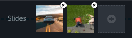
上傳圖片後的 gallery 範例:
參數
| 名稱 | 類型 | 預設值 | 描述 |
|---|---|---|---|
id | string | - | 控制項將保存您資料的鍵的識別碼 |
type | string | - | 控制項的類型應設為 "gallery" |
label? | string | - | 顯示在控制項左側的標籤 |
icon? | string | - | 將在控制項標籤左側顯示的圖標名稱。查看所有 icons. |
position? | number | - | 控制項在工具列中的位置 |
devices? | "all" | "desktop" | "responsive" | "all" | 定義控制項將在哪些設備上顯示。"all" 會在所有設備上渲染控制項。"desktop" 只會在桌面設備上渲染控制項。"responsive" 會在平板和手機設備上渲染控制項。 |
disabled? | boolean | false | 配置控制項被禁用或啟用的條件。 |
disabled? | boolean | false | 配置控制項被禁用或啟用的條件。 |
display? | "inline" | "block" | "inline" | 配置控制項及其標籤的排列方式。如果 display 設為 "inline",則標籤和控制項將在同一行。如果設為 "block",則標籤在第一行,控制項在下一行顯示。 |
helper?.content | string | - | 如果提供,則會在標籤旁顯示一個圖標。當懸停在該圖標上時,會顯示一個包含額外資訊的提示框。 |
helper?.position | "top-start" | "top" | "top-end" | "right-start" | "right" | "right-end" | "bottom-end" | "bottom" | "bottom-start" | "left-end" | "left" | "left-start" | "top" | "top" | 指定提示框相對於輔助圖標的位置 |
states? | Array<State> | ["normal"] | 允許基於元素狀態設置不同樣式 State = "normal" | "hover" | "active" "normal" - 元素的正常狀態, "hover" - 當元素被懸停時的狀態, "active" - 當元素被激活時的狀態(例如,分頁中的當前頁面) |
config?.canDeleteLast | boolean | true | 如果設為 false,用戶無法刪除圖庫中的最後一個項目。 |
default? | Default | - | Default: { value: string; }控制項的預設值應為 Image[] 的 JSON.stringify。 Image: { id: number; uid: string; fileName: string; width: number; height: number; } id - 圖片在圖庫中的索引 uid - 圖片的唯一識別碼 fileName - 圖片的文件名 width - 圖片的寬度 height - 圖片的高度 |
style? | function | - | 此函數根據控制項的值生成 CSS 輸出。參數是一個包含 value 鍵的物件,該鍵持有控制項的當前值。該函數返回一個包含 CSS 選擇器鍵和 CSS 屬性值的物件。
|
基本範例
僅使用必需的鍵進行標準定義。此控制項將在所有設備上顯示。
{
  id: "slides",
  type: "gallery"
}
返回值
返回一個物件數組的字串化陣列,具有以下值:
{
  id: number;
  uid: string;
  fileName: string;
  width: number;
  height: number;
}
範例:
{
  value: '[
    {
      "id": 1,
      "uid": "dbe3a79df22c4ef2ac6553aa241d2c5c.jpg",
      "fileName": "image1.jpg",
      "width": 1600,
      "height": 1042
    },
    {
      "id": 2,
      "uid": "a7c45ea83554c81024b84d724fd8286d.jpg",
      "fileName": "image2.jpg",
      "width": 640,
      "height": 359
    }
  ]'
}
用法
標籤範例
在控制項左側添加標籤。
{
  id: "slides",
  type: "gallery",
  label: "Slide Show"
}
圖標範例
在控制項標籤左側添加一個 "gallery" 圖標。
{
  id: "slides",
  type: "gallery",
  icon: "nc-gallery"
}
設備範例
此控制項將在所有設備上渲染。此值可以省略,因為它的預設值為 "all"。
{
  id: "slides",
  type: "gallery",
  devices: "all"
}
僅在 desktop 設備上渲染。
{
  id: "slides",
  type: "gallery",
  devices: "desktop"
}
僅在 tablet 和 mobile 設備上顯示。
{
  id: "slides",
  type: "gallery",
  devices: "responsive"
}
禁用範例
控制項將被禁用。通常,這裡應該是您的動態條件。
{
  id: "slides",
  type: "gallery",
  disabled: true
}
當 mediaType 變數不是 "slideshow" 時,控制項將被禁用。
getValue 是一個允許我們通過 ID 獲取控制項值的 getter 函數。
"mediaType" 是下面 "radioGroup" 控制項的 ID。
const getToolbarContols = ({ getValue }) => {
  const mediaType = getValue("media");

  return [
    {
      id: "media",
      type: "radioGroup",
      label: "Type",
      choices: [
        { value: "image", icon: "nc-media-image" },
        { value: "video", icon: "nc-media-video" },
        { value: "slideshow", icon: "nc-reorder" },
      ],
    },
    {
      id: "slides",
      type: "gallery",
      disabled: mediaType !== "slideshow",
    },
  ];
};
顯示範例
在此範例中,使用 display: "block",標籤將顯示在第一行,控制項將顯示在第二行。
{
  id: "slides",
  type: "gallery",
  display: "block"
}
幫助範例
helper 物件包含一個值為 "Helper" 的 content 屬性,這將作為額外的指導或信息顯示給用戶。
{
  id: "slides",
  type: "gallery",
  helper: {
    content: "Helper"
  }
}
當 helper 物件包含 position 屬性且值為 "top-start" 時,表示幫助文本將顯示在圖標的頂部開始位置。
{
  id: "slides",
  type: "gallery",
  helper: {
    content: "Helper",
    position: "top-start"
  }
}
狀態範例
允許控制項在正常和懸停狀態下運作。
{
  id: "slides",
  type: "gallery",
  states: ["normal", "hover"]
}
允許控制項在正常、懸停和活動狀態下運作。
{
  id: "slides",
  type: "gallery",
  states: ["normal", "hover", "active"]
}
配置 canDeleteLast 範例
在此範例中,使用者無法刪除圖庫中的最後一個項目。
{
  id: "slides",
  type: "gallery",
  config: {
    canDeleteLast: false
  }
}
預設值範例
在此範例中,為 gallery 控制項設置預設值。
{
  id: "slides",
  type: "gallery",
  default: {
    value: '[
      {
        id: "1",
        uid:"dbe6479df22c4ef2ac6553aa241d2c5c.jpg",
        fileName: "image1.jpg",
        width: 800,
        height: 600
      },
      {
        id: "2",
        uid:"fbe6479df22c4ef2ac6555te241d2c5c.jpg",
        fileName: "image2.jpg",
        width: 1024,
        height: 768
      }
    ]'
  }
}
CSS 範例
在此範例中,展示如何對圖庫圖片應用基本樣式。
{
  id: "slides",
  type: "gallery",
  style: ({ value }) => {
    return value.reduce((styles, image, index) => {
      styles[`{{WRAPPER}} .brz-gallery .brz-image-${index}`] = {
        backgroundImage: `url(${image.fileName})`,
        width: `${image.width}px`,
      };
      return styles;
    }, {});
  }
}
在 HTML 中的使用範例
import { Brizy } from "@brizy/core";
import React, { JSX } from "react";

interface Image {
  id: number;
  fileName: string;
  width: number;
  height: number;
}

interface Props {
  slides: string;
}

const Gallery = (props: Props): JSX.Element => {
  const { slides } = props;
  const images: Image[] = JSON.parse(slides);

  return (
    <div className="brz-gallery">
      {images.map((image) => (
        <div
          key={image.id}
          style={{
            backgroundImage: `url(${image.fileName})`,
            width: image.width,
            height: image.height,
          }}
        />
      ))}
    </div>
  );
};

Brizy.registerComponent({
  id: "ThirdParty.Gallery",
  component: { editor: Gallery, view: Gallery },
  title: "My Gallery",
  category: "custom",
  options: (props) => {
    return [
      {
        selector: ".brz-gallery",
        toolbar: [
          {
            id: "toolbarCurrentElement",
            type: "popover",
            config: {
              icon: "nc-gallery",
              title: "Slides",
            },
            devices: "desktop",
            options: [
              {
                id: "slides",
                type: "gallery",
              },
            ],
          },
        ],
      },
    ];
  },
});