彈出按鈕
popover 控件是一個帶有圖標的按鈕觸發器,可用於打開和關閉彈出框。此外,當鼠標懸停在按鈕上時,它可以顯示工具提示文字,提供有關按鈕用途或功能的更多信息。
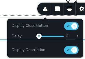
控件範例:
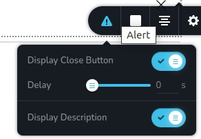
懸停在按鈕上的控件範例:
參數
| 名稱 | 類型 | 預設值 | 描述 |
|---|---|---|---|
id | string | - | popover 的唯一識別符。這用於區分多個彈出框 |
type | string | - | 類型應設為 "popover" 以使用此控件 |
className? | string | - | 自定義的 CSS 類名,將設置在控件上。可以用於修改控件樣式。 |
position? | number | - | 控件在工具欄中的位置 |
roles? | Array<Role> | - | 僅在當前用戶的角色與提供的角色陣列中的某一角色匹配時渲染控件。type Role = "admin" | "viewer" | "editor" | "designer" | "manager" |
devices? | "all" | "desktop" | "responsive" | "all" | 定義控件將在哪些設備上渲染。"all" 在所有設備上渲染控件。"desktop" 僅在桌面設備上渲染控件。"responsive" 在平板和手機設備上渲染控件 |
disabled? | boolean | false | 配置控件被禁用或啟用的條件 |
options? | Array<ControlItem> | - | 將顯示在彈出框內的控件陣列ControlItem = { id: number; type: string; label?: string; disabled?: boolean; devices?: "all" | "desktop" | "responsive" } id - 將存儲數據的其他�控件的 idtype - 控件的類型 label - 顯示在控件左側的標籤 disabled - 配置控件禁用或啟用的條件 devices - 定義控件將在哪些設備上渲染 |
config?.placement | "auto" | "auto-start | "auto-end" | "top" | "top-start" | "top-end" | "bottom" | "bottom-start" | "bottom-end" | "right" | "right-start" | "right-end" | "left" | "left-start" | "left-end" | "top" | 確定彈出框相對於按鈕的位置 |
config?.size | "small" | "medium" | "large" | "xlarge" | "auto" | "medium" | 指定彈出框的大小 |
config?.icon | string | "nc-cog" | 按鈕內顯示的圖標 |
config?.title | string | - | 按鈕的 title 屬性,在用戶將鼠標懸停在按鈕上時顯示為工具提示 |
config?.onO penDirect | boolean | false | 決定彈出框內容是否在工具欄打開時立即顯示,而不是等待按鈕點擊 |
基本範例
包含控制正常運行所需的必要鍵的標準定義。將在所有設備上顯示。
{
id: "popover",
type: "popover",
options: [
{
id: "closeButtonState",
type: "switch",
label: "Display Close Button"
}
]
}
返回值
無返回值。
用法
類名範例
為控件的 DOM 節點添加 CSS 類。
{
id: "popover",
type: "popover",
className: "myPopover"
}
角色範例
僅向具有管理員和設計師權限的用戶顯示控件。
{
id: "popover",
type: "popover",
roles: ["admin", "designer"]
}
設備範例
將在所有設備上渲染。這個值可以跳過,因為它默認設置為 "all"。
{
id: "popover",
type: "popover",
devices: "all",
options: [
{
id: "closeButtonState",
type: "switch",
label: "Display Close Button"
}
]
}
僅在 desktop 上渲染。
{
id: "popover",
type: "popover",
devices: "desktop",
options: [
{
id: "closeButtonState",
type: "switch",
label: "Display Close Button"
}
]
}
顯示僅限於響應模式,特別是 tablet 和 mobile。
{
id: "popover",
type: "popover",
devices: "responsive",
options: [
{
id: "closeButtonState",
type: "switch",
label: "Display Close Button"
}
]
}
禁用範例
控件將被禁用。通常,這裡應該是你的動態條件。
{
id: "popover",
type: "popover",
disabled: true,
options: [
{
id: "closeButtonState",
type: "switch",
label: "Display Close Button"
}
]
}
當 videoType 變量為 "custom" 時,控件將被禁用。 getValue 是一個 getter 函數,允許我們通過控件的 id 獲取其值。 "videoType" 是下面 "select" 控件的 id。
const getToolbarContols = ({ getValue }) => {
  const videoType = getValue("videoType");

  return [
    {
      id: "videoType",
      type: "select",
      choices: [
        { title: "Youtube", value: "youtube" },
        { title: "Custom", value: "custom" },
      ],
    },
    {
      id: "popover",
      type: "popover",
      disabled: videoType === "custom",
      options: [
        {
          id: "closeButtonState",
          type: "switch",
          label: "Display Close Button",
        },
      ],
    },
  ];
};
配置 placement 範例
確定彈出框相對於按鈕的位置。
{
id: "popover",
type: "popover",
config: {
placement: "bottom"
},
options: [
{
id: "closeButtonState",
type: "switch",
label: "Display Close Button"
}
]
}
配置 size 範例
指定彈出框的大小。
{
id: "popover",
type: "popover",
config: {
size: "xlarge"
},
options: [
{
id: "closeButtonState",
type: "switch",
label: "Display Close Button"
}
]
}
配置 icon 範例
按鈕內顯示的圖標。
{
id: "popover",
type: "popover",
config: {
icon: "nc-alert"
},
options: [
{
id: "closeButtonState",
type: "switch",
label: "Display Close Button"
}
]
}
配置 title 範例
按鈕的
title 屬性,在用戶將鼠標懸停在按鈕上時顯示為工具提示。
{
id: "popover",
type: "popover",
config: {
title: "Title"
},
options: [
{
id: "closeButtonState",
type: "switch",
label: "Display Close Button"
}
]
}
�配置 onOpenDirect 範例
決定彈出框內容是否在工具欄打開時立即顯示,而不是等待按鈕點擊。
{
id: "popover",
type: "popover",
config: {
onOpenDirect: true
},
options: [
{
id: "closeButtonState",
type: "switch",
label: "Display Close Button"
}
]
}