動畫
animation 控制項提供 13 種預設動畫,可以應用於元素的正常狀態和懸停狀態。它允許自訂參數,如持續時間、延遲、方向等。
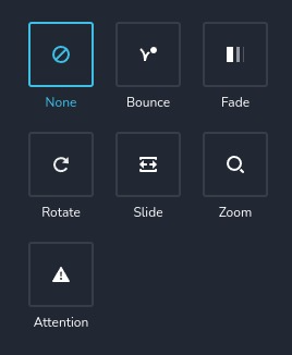
控制項範例:
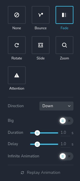
選擇 "fade" 動畫的控制項範例:
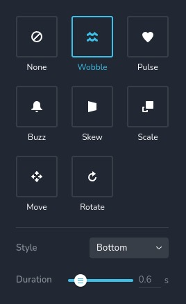
通常用於 "hover" 的動畫控制項範例:
參數
| 名稱 | 類型 | 預設值 | 描述 |
|---|---|---|---|
id | string | - | animation 儲存資料的鍵的識別碼 |
type | string | - | 類型應為 "animation" 以使用此控制項 |
label? | string | - | 顯示在控制項上方的標籤 |
className? | string | - | 自訂的 CSS 類名稱,將設置在控制項上,可用於修改控制項樣式 |
icon? | string | - | 顯示在控制項標籤左側的圖示名稱。查看所有 圖示 |
position? | number | - | 控制項在工具列中的位置 |
roles? | Array<Role> | - | 只有當當前用戶的角色與提供的數組中的角色匹配時才顯示控制項。 type Role = "admin" | "viewer" | "editor" | "designer" | "manager" |
devices? | "all" | "desktop" | "responsive" | "all" | 定義控制項顯示的設備。"all" 在所有設備上顯示控制項。"desktop" 只在桌面設備上顯示控制項。"responsive" 在平板和手機設備上顯示控制項 |
disabled? | boolean | false | 配置控制項在何種條件下被禁用或啟用 |
helper?.content | string | - | 如果提供,顯示在標籤旁邊的圖示。當懸停於此圖示上時,會顯示帶有額外資訊的提示 |
helper?.position? | "top-start" | "top" | "top-end" | "right-start" | "right" | "right-end" | "bottom-end" | "bottom" | "bottom-start" | "left-end" | "left" | "left-start" | "top" | 指定提示相對於幫助圖示的位置 |
config?.type | Array<EffectType> | ["none", "bounce", "fade", "rotate", "slide", "zoom", "attention"] | 指定可用的動畫類型列表 EffectType = "none" | "bounce" | "fade" | "rotate" | "slide" | "zoom" | "attention" | "pulse" | "wobble" | "buzz" | "scale" | "skew" | "move" |
config?.replay | boolean | true | 啟用通過點擊特殊按鈕重播動畫的能力。如果為 false,則按鈕不會顯示 |
config?.infiniteAnimation | boolean | true | 允許動畫無限循環。可以使用特殊的開關切換此功能。如果為 false,則開關不會顯示 |
config?.delay | boolean | true | 啟用使用特殊滑塊更改動畫延遲的能力。如果為 false,則滑塊不會顯示 |
default? | Default | - | 控制項的預設值。 Default: { name: AnimationName; duration: number; delay: number; infiniteAnimation: boolean; } name - 動畫名稱, duration - 動畫持續時間(以毫秒為單位), delay - 動畫開始前的延遲(以毫秒為單位), infiniteAnimation - 指示動畫是否應無限循環, AnimationName 是一個獨特的字串,識別動畫。您也可以定義具有特定 direction 或 style 的動畫。以下是所有動畫名稱的列表: 無 "none" - 無動畫 進入動畫 1. 彈跳 "bounce" - 方向 None "bounceIn" - 方向 In "bounceInDown" - 方向 Down "bounceInRight" - 方向 Right "bounceInUp" - 方向 Up "bounceInLeft" - 方向 Left 2. 淡入 "fadeIn" - 方向 None "fadeInDown" - 方向 Down 且 Big 設為 false "fadeInDownBig" - 方向 Down 且 Big 設為 true "fadeInRight" - 方向 Right 且 Big 設為 false "fadeInRightBig" - 方向 Right 且 Big 設為 true "fadeInUp" - 方向 Up 且 Big 設為 false "fadeInUpBig" - 方向 Up 且 Big 設為 true "fadeInLeft" - 方向 Left 且 Big 設為 false "fadeInLeftBig" - 方向 Left 且 Big 設為 true 3. 旋轉 "rotateIn" - 方向 None "rotateInDownLeft" - 方向 Down Left "rotateInDownRight" - 方向 Down Right "rotateInUpLeft" - 方向 Up Left "rotateInUpRight" - 方向 Up Right 4. 滑動 "slideInDown" - 方向 Down "slideInRight" - 方向 Right "slideInUp" - 方向 Up "slideInLeft" - 方向 Left 5. 縮放 "zoomIn" - 方向 None "zoomInDown" - 方向 Down "zoomInRight" - 方向 Right "zoomInUp" - 方向 Up "zoomInLeft" - 方向 Left 6. 注意 "flash" - 樣式 Flash "jackInTheBox" - 樣式 JackInTheBox "jello" - 樣式 Jello "lightSpeedIn" - 樣式 Light Speed In "pulse" - 樣式 Pulse "rollIn" - 樣式 Roll In "rubberBand" - 樣式 Rubber Band "tada" - 樣式 Tada "shake" - 樣式 Shake "swing" - 樣式 Swing "wobble" - 樣式 Wobble 懸停動畫 1. 擺動 "brz-wobble-horizontal" - 樣式 Horizontal "brz-wobble-vertical" - 樣式 Vertical "brz-wobble-to-bottom-right" - 樣式 Bottom Right "brz-wobble-to-top-right" - 樣式 Top Right "brz-wobble-top" - 樣式 Top "brz-wobble-bottom" - 樣式 Bottom "brz-wobble-skew" - 樣式 Skew 2. 脈衝 "brz-pulse" - 樣式 Pulse "brz-pulse-grow" - 樣式 Pulse Grow "brz-pulse-shrink" - 樣式 Pulse Shrink 3. 嗡嗡聲 "brz-buzz" - 樣式 Buzz "brz-buzz-out" - 樣式 Buzz Out 4. 傾斜 "brz-skew" - 樣式 Skew "brz-skew-forward" - 樣式 Skew Forward "brz-skew-backward" - 樣式 Skew Backward 5. 縮放 "brz-pop" - 樣式 Pop "brz-push" - 樣式 Push "brz-bounce-in" - 樣式 Bounce In "brz-bounce-out" - 樣式 Bounce Out "brz-grow" - 樣式 Grow "brz-shrink" - 樣式 Shrink 6. 移動 "brz-float" - 方向 Up "brz-sink" - 方向 Down "brz-backward" - 方向 Left "brz-forward" - 方向 Right "brz-hang" - 方向 Hang "brz-bob" - 方向 Bob 7. 旋轉 "brz-rotate" - 樣式 Rotate "brz-grow-rotate" - 樣式 Grow Rotate |
style? | function | - | 此函數根據控制項的值生成 CSS 輸出。參數是一個包含 value 鍵的對象,該鍵保存控制項的當前值。函數返回一個包含 CSS 選擇器鍵和 CSS 屬性值的對象。
|
基本範例
使用僅有必要鍵的標準定義。此控制項將顯示於所有設備上。
{
  id: "animation",
  type: "animation"
}
返回值
返回一個包含以下值的對象:
{
  name: AnimationName;
  duration: number;
  delay: number;
  infiniteAnimation: false;
}
name - 與 參數 - 預設值 中描述的動畫相同;
duration - 動畫持續時間(以毫秒為單位);
delay - 動畫開始前的延遲(以毫秒為單位);
infiniteAnimation - 指示動畫是否應無限循環;
值的範例:
{
  delay: 0,
  duration: 600,
  infiniteAnimation: true,
  name: "fadeInDownBig"
}
使用方式
標籤範例
在動畫列表的上方添加標籤。
{
  id: "animation",
  label: "Animations",
  type: "animation"
}
類名範例
將 CSS 類添加到控制項的 DOM 節點中。
{
  id: "animation",
  type: "animation",
  className: "myAnimation"
}
圖示範例
在控制項標籤的左側添加 "settings" 圖示。
{
  id: "animation",
  type: "animation",
  icon: "nc-cog"
}
角色範例
僅對具有 admin 和 designer 權限的用戶顯示控制項。
{
  id: "animation",
  type: "animation",
  roles: ["admin", "designer"]
}
設備範例
此控制項將在所有設備上呈現。此值可以省略,因為預設為 "all"。
{
  id: "animation",
  type: "animation",
  devices: "all"
}
僅在 desktop 上呈現。
{
  id: "animation",
  type: "animation",
  devices: "desktop"
}
顯示僅限於響應式模式,特別是 tablet 和 mobile。
{
  id: "animation",
  type: "animation",
  devices: "responsive"
}
禁用範例
控制項將被禁用。通常,這裡應該是您的動態條件。
{
  id: "animation",
  type: "animation",
  disabled: true
}
當 videoType 變數為 "custom" 時,控制項將被禁用。
getValue 是一個 getter 函數,允許我們通過其 id 獲取控制項的值。
"videoType" 是下面 "select" 控制項的 id。
const getToolbarContols = ({ getValue }) => {
  const videoType = getValue("videoType");

  return [
    {
      id: "videoType",
      type: "select",
      choices: [
        { title: "Youtube", value: "youtube" },
        { title: "Custom", value: "custom" },
      ],
    },
    {
      id: "animation",
      type: "animation",
      disabled: videoType === "custom",
    },
  ];
};
幫助範例
helper 對象包含一個 content 屬性,其值為 "help text",將顯示為用戶的附加指導或信息。
{
  id: "animation",
  type: "animation",
  helper: {
    content: "help text"
  }
}
當 helper 對象包含一個 position 屬性,其值為 "top-start",則表示幫助文本將顯示在圖示的左上角。
{
  id: "animation",
  type: "animation",
  helper: {
    content: "help text",
    position: "top-start"
  }
}
配置 types 範例
指定可用的動畫類型列表。
{
  id: "animation",
  type: "animation",
  config: {
    types: ["wobble", "buzz", "scale"]
  }
}
配置 replay 範例
啟用通過點擊特殊按鈕重播動畫的功能。在此情況下,按鈕將不會呈現。
{
  id: "animation",
  type: "animation",
  config: {
    replay: false
  }
}
配置 infiniteAnimation 範例
允許動畫無限循環。可以使用特殊的開關切換此功能。在此情況下,開關將不會呈現。
{
  id: "animation",
  type: "animation",
  config: {
    infiniteAnimation: false
  }
}
配置 delay 範例
啟用使用特殊滑塊更改動畫延遲的功能。在此情況下,滑塊將不會呈現,動畫將不會有延遲。
{
  id: "animation",
  type: "animation",
  config: {
    delay: false
  }
}
預設值範例
在 default 對象中,您可以設置任何 animation 屬性的預設值。在此情況下,元素在懸停時會稍微向上移動。
{
  id: "animation",
  type: "animation",
  default: {
    delay: 0,
    duration: 1000,
    infiniteAnimation: true,
    name: "brz-float"
  }
}
CSS 範例
這是一個抽象範例,通常您不會手動控制任何動畫。 在這種情況下,map 背景顏色將是紅色,如果動畫類型是 "pulse",否則為黑色。
{
  id: "animation",
  type: "animation",
  style: ({ value }) => {
    return {
      "{{WRAPPER}} .brz-ui-ed-iframe": {
        "background-color": value.type === "pulse" ? "red" : "black"
      }
    }
  }
}
在 HTML 中使用範例
要檢索控制項的返回值,使用以下規則從組件的屬性中訪問必要的值:將 animation 控制項的 id 與您希望提取的值進行串聯。下面的範例演示了如何提取 entrance 和 hover 動畫的所有值。
import { Brizy } from "@brizy/core";

interface Props {
  animationName: string;
  animationDelay: number;
  animationInfiniteAnimation: boolean;
  animationDuration: number;
  hoverName: string;
  hoverDelay: number;
  hoverInfiniteAnimation: boolean;
  hoverDuration: number;
}

const Component = (props: Props) => {
  const {
    animationName,
    animationDelay,
    animationInfiniteAnimation,
    animationDuration,
    hoverName,
    hoverDelay,
    hoverInfiniteAnimation,
    hoverDuration,
  } = props;

  return (
    <div className="component">
      <p
        style={{
          color: animationName === "bounce" ? "black" : "red",
          transition: `color ${animationDuration / 1000}s`,
        }}
      >
        Text
      </p>
      <p style={{ color: hoverName === "brz-buzz" ? "blue" : "yellow", transition: `color ${hoverDuration / 1000}s` }}>
        Text
      </p>
    </div>
  );
};

Brizy.registerComponent({
  id: "ThirdParty.Component",
  component: { editor: Component, view: Component },
  title: "Component",
  category: "custom",
  options: (props) => {
    return [
      {
        selector: ".component",
        sidebar: [
          {
            id: "sidebarTabs",
            type: "sidebarTabs",
            tabs: [
              {
                id: "effects",
                title: "Effects",
                label: "Effects",
                options: [
                  {
                    id: "tabs",
                    type: "tabs",
                    config: {
                      align: "start",
                    },
                    tabs: [
                      {
                        id: "entrance",
                        label: "Entrance",
                        options: [
                          {
                            id: "animation",
                            type: "animation",
                          },
                        ],
                      },
                      {
                        id: "tabHover",
                        label: "Hover",
                        options: [
                          {
                            id: "hover",
                            type: "animation",
                            config: {
                              types: ["wobble", "pulse", "buzz", "skew", "scale", "move", "rotate2"],
                              replay: false,
                              infiniteAnimation: true,
                              delay: false,
                            },
                            default: {
                              name: "none",
                              duration: 0,
                              delay: 0,
                              infiniteAnimation: false,
                            },
                          },
                        ],
                      },
                    ],
                  },
                ],
              },
            ],
          },
        ],
      },
    ];
  },
});