Internal Link
Brizy's internalLink control lets you easily redirect users to any page within your website. This feature enhances navigation, improving user experience by seamlessly guiding visitors to related content or important sections.
Example of the internalLink:

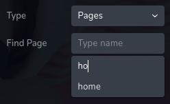
Example of the internalLink search:

Example of the internalLink result:
Parameters
| Name | Type | Default | Description |
|---|---|---|---|
id | string | - | The identifier of the key where the internalLink will save your data |
type | string | - | Type should be "internalLink" to use this control |
placeholder? | string | - | The placeholder text displayed in the input field. |
label? | string | - | The label displayed on the left side of the control |
className? | string | - | The custom CSS class name that will be set on the control. It can be used to modify the control styles. |
icon? | string | - | Icon name that will be rendered on left side of the control's label. View all icons. |
position? | number | - | The position of the control in toolbar |
devices? | "all" | "desktop" | "responsive" | "all" | Define the devices where the control will be rendered. "all" renders the control on all devices. "desktop" renders the control only on desktop devices. "responsive" renders the control on both tablet and mobile devices. |
roles? | Array<Role> | - | Render the control only if the current user's role matches one of the roles in the provided array. type Role = "admin" | "viewer" | "editor" | "designer" | "manager" |
states? | Array<State> | ["normal"] | Allows for different styles based on the element's state State = "normal" | "hover" | "active" "normal" - the normal state of an element, "hover" - the state when the element is hovered over, "active" - the state when the element is active (e.g., current page in pagination) |
disabled? | boolean | false | Configure the condition under which the control is disabled or enabled. |
helper?.content | string | - | If provided, an icon is displayed next to the label. When hovering over this icon, a tooltip with additional information appears. |
helper?.position | "top-start" | "top" | "top-end" | "right-start" | "right" | "right-end" | "bottom-end" | "bottom" | "bottom-start" | "left-end" | "left" | "left-start" | "top" | Specifies the position of the tooltip relative to the helper icon. |
config?.sourceLabel | string | "Type" | The label for the first select is displayed on the left side of the control. |
default? | Default | - | The default control value. Default: { value: string; title: string; source: string; } value - the control's custom initial value title - the label of the selected value. source - the collection from where we try to find a link. This indicates the dataset or collection used to locate and retrieve the selected value and its corresponding title. |
style? | function | - | This function generates CSS output based on the value from the control. The parameter is an object containing a value key, which holds the current value of the control. The function returns an object with a CSS selector key and CSS property values.
|
Basic example
Standard definition with only the required keys. This control will be displayed on all devices.
{
  id: "link",
  type: "internalLink"
}
Return value
Returns an object with the following values:
{
  value: string;
  title: string;
  source: string;
}
value - the actual selected value.
title - the label of the selected value.
source - the collection from where we try to find a link. This indicates the dataset or collection used to locate and retrieve the selected value and its corresponding title.
Example of the return value:
{
  value: "/about",
  title: "About",
  source: "pages"
}
Usage
Placeholder example
Adding the placeholder text for the control.
{
  id: "link",
  type: "internalLink",
  placeholder: "Find page"
}
Label example
Adding a label on the left side of the control.
{
  id: "link",
  label: "Redirect",
  type: "internalLink"
}
Class name example
Adding a CSS class to the control's DOM node.
{
  id: "link",
  type: "internalLink"
  className: "internal-link"
}
Icon example
Adding a "link" icon to the left of the control's label.
{
  id: "link",
  type: "internalLink"
  icon: "nc-link"
}
Devices examples
It will be rendered on all devices. This value can be skipped because it is set to "all" by default.
{
  id: "link",
  type: "internalLink",
  devices: "all"
}
Rendering will occur only on desktop.
{
  id: "link",
  type: "internalLink",
  devices: "desktop"
}
The display is limited to responsive modes, specifically tablet and mobile.
{
  id: "link",
  type: "internalLink",
  devices: "responsive"
}
Roles example
Show the control only to users with admin and designer privileges.
{
  id: "link",
  type: "internalLink",
  roles: ["admin", "designer"]
}
States example
Allows the control to work in normal and hover states.
{
  id: "link",
  type: "internalLink",
  states: ["normal", "hover"]
}
Allows the control to work in normal, hover and active states.
{
  id: "link",
  type: "internalLink",
  states: ["normal", "hover", "active"]
}
Disabled examples
Control will be disabled. Normally, here should be your dynamic condition.
{
  id: "link",
  type: "internalLink",
  disabled: true
}
Control will be disabled when videoType variable will be "custom".
getValue is a getter function that allows us to retrieve the value of controls by their id.
"videoType" is the id of the "select" control below.
const getToolbarContols = ({ getValue }) => {
  const videoType = getValue("videoType");

  return [
    {
      id: "videoType",
      type: "select",
      choices: [
        { title: "Youtube", value: "youtube" },
        { title: "Custom", value: "custom" }
      ]
    },
    {
      id: "link",
      type: "internalLink",
      disabled: videoType === "custom"
    }
  ]
}
Helper examples
The helper contains a content property with the value "help text", which will be displayed as additional guidance or information for the user.
{
  id: "link",
  type: "internalLink",
  config: {
    helper: "help text"
  }
}
When the helper object contains a position property with the value "top-end", it indicates that the helper text will
be displayed in the top right corner of the icon.
{
  id: "link",
  type: "internalLink",
  helper: {
    content: "help text",
    position: "top-start"
  }
}
Config sourceLabel examples
Label for the first dropdown on the left.
{
  id: "link",
  type: "internalLink",
  config: {
    sourceLabel: "Source"
  }
}
Default value examples
In this example, the internalLink control will have the default: value "/home" , label "Home" and the source "pages".
{
  id: "link",
  type: "internalLink",
  default: {
    label: "Home",
    value: "/home",
    source: "pages"
  }
}
In this example the source is set to "pages" and the default value is "/about".
{
  id: "link",
  type: "internalLink",
  default: {
    value: "/about",
    source: "pages"
  }
}
CSS example
Add or remove text-decoration based on the value of the control for the selector .brz-text.
{
  id: "link",
  type: "internalLink",
  style: ({ value }) => {
    return {
      ".brz-text": {
        "text-decoration": value.value ? "underline" : "none"
      }
    }
  }
}
Usage in HTML example
In the example below, we use the internalLink output value to determine the href attribute of the <a> tag.
import { Brizy } from "@brizy/core";
import React, { JSX } from "react";

interface Props {
  link: string;
  linkTitle: string;
}

const Anchor = (props: Props): JSX.Element => {
  const { link, linkTitle } = props;

  return (
    <div className="brz-a">
      <h3>Go To :</h3>
      <a href={link}>{linkTitle}</a>
    </div>
  );
};

Brizy.registerComponent(Anchor, {
  id: "ThirdParty.Anchor",
  title: "Anchor",
  options: (props) => {
    return [
      {
        selector: ".brz-a",
        toolbar: [
          {
            id: "toolbarCurrentElement",
            type: "popover",
            options: [
              {
                id: "link",
                type: "internalLink",
                devices: "desktop"
              }
            ]
          }
        ]
      }
    ];
  }
});