Typography
The typography control provides a comprehensive set of features for manipulating text on a web page. It supports loading fonts from Google Fonts or custom sources, altering CSS properties related to text appearance (such as strikethrough, bold, italic, underline, uppercase, and lowercase), and selecting or adding fonts from global styles. Additionally, it allows for adjusting text size, weight, line height, and letter spacing.
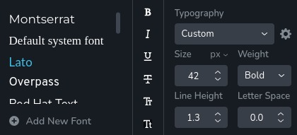
Example of the control:
Parameters
| Name | Type | Default | Description |
|---|---|---|---|
id | string | - | The identifier of the key where the typography will save your data |
type | string | - | Type should be "typography" to use this control |
className? | string | - | The custom CSS class name that will be set on the control. It can be used to modify the control styles |
position? | number | - | The position of the control in toolbar |
roles? | Array<Role> | - | Render the control only if the current user's role matches one of the roles in the provided array. type Role = "admin" | "viewer" | "editor" | "designer" | "manager" |
devices? | "all" | "desktop" | "responsive" | "all" | Define the devices where the control will be rendered. "all" renders the control on all devices. "desktop" renders the control only on desktop devices. "responsive" renders the control on both tablet and mobile devices |
disabled? | boolean | false | Configure the condition under which the control is disabled or enabled |
config?.fontFamily | boolean | true | Determines whether the font family can be selected |
config?.fontSize | Boundaries | min: 0 max: 300 | Sets the minimum and maximum boundaries for font size Boundaries: { min: number; max: number } |
config?.lineHeight | Boundaries | min: 1 max: 20 | Sets the minimum and maximum boundaries for line height Boundaries: { min: number; max: number } |
config?.letterSpacing | Boundaries | min: -20 max: 20 | Sets the minimum and maximum boundaries for letter spacing Boundaries: { min: number; max: number } |
config?.scriptChoices | TextScripts[] | - | Determines whether the text can be formatted as subscript or superscript TextScripts = "sub" | "super" |
default? | Default | - | The default control value. Accepts all the fields as in the return value |
selector? | string | - | The CSS selector to which the styles will be applied |
style? | function | - | This function generates CSS output based on the value from the control. The parameter is an object containing a value key, which holds the current value of the control. The function returns an object with a CSS selector key and CSS property values.
|
Basic example
Standard definition with only the required keys. This control will be displayed on all devices.
{
  id: "typography",
  type: "typography"
}
Return value
Return an object with the following values:
{
  bold: boolean;
  fontFamily: string;
  fontFamilyType: "google" | "upload" | "system";
  fontSize: number;
  fontSizeSuffix: "px" | "em" | "rem" | "vw";
  fontSoftness: number;
  fontStyle: string;
  fontWeight: 100 | 200 | 300 | 400 | 500 | 600 | 700 | 800 | 900;
  fontWidth: number;
  italic: boolean;
  letterSpacing: number;
  lineHeight: number;
  lowercase: boolean;
  script: undefined | "super" | "sub";
  strike: boolean;
  underline: boolean;
  uppercase: boolean;
  variableFontWeight: number;
}
bold - indicates whether the text is bold;
fontFamily - the selected font family;
fontFamilyType - the type of font family used (Google Fonts, uploaded custom font, or system font);
fontSize - the size of the font;
fontSizeSuffix - the unit suffix for the font size;
fontSoftness - represents the softness of the font, typically affecting the visual smoothness;
fontStyle - indicates which global typography style is used;
fontWeight - the weight of the font, ranging from thin (100) to extra bold (900);
fontWidth - the width of the font;
italic - indicates whether the text is italic;
letterSpacing - the spacing between letters;
lineHeight - the height of the line;
lowercase - indicates whether the text is lowercase;
script - indicates whether the text is in superscript or subscript format;
strike - indicates whether the text has a strikethrough;
underline - indicates whether the text is underlined;
uppercase - indicates whether the text is uppercase;
variableFontWeight - the weight of the variable font, allowing for more precise adjustments;
Example of the return value:
{
  bold: false,
  fontFamily: "overpass",
  fontFamilyType: "google",
  fontSize: 36,
  fontSizeSuffix: "px",
  fontSoftness: 0,
  fontStyle: "heading2",
  fontWeight: 700,
  fontWidth: 100,
  italic: false,
  letterSpacing: -1.5,
  lineHeight: 1.3,
  lowercase: false,
  script: undefined,
  strike: false,
  underline: false,
  uppercase: false,
  variableFontWeight: 400
}
Usage
Class name example
Adding a CSS class to the control's DOM node.
{
  id: "typography",
  type: "typography"
  className: "myTypography"
}
Roles example
Show the control only to users with admin and designer privileges.
{
  id: "typography",
  type: "typography",
  roles: ["admin", "designer"]
}
Devices examples
It will be rendered on all devices. This value can be skipped because it is set to "all" by default.
{
  id: "typography",
  type: "typography",
  devices: "all"
}
Rendering will occur only on desktop.
{
  id: "typography",
  type: "typography",
  devices: "desktop"
}
The display is limited to responsive modes, specifically tablet and mobile.
{
  id: "typography",
  type: "typography",
  devices: "responsive"
}
Disabled examples
Control will be disabled. Normally, here should be your dynamic condition.
{
  id: "typography",
  type: "typography",
  disabled: true
}
Control will be disabled when videoType variable will be "custom".
getValue is a getter function that allows us to retrieve the value of controls by their id.
"videoType" is the id of the "select" control below.
const getToolbarContols = ({ getValue }) => {
  const videoType = getValue("videoType");

  return [
    {
      id: "videoType",
      type: "select",
      choices: [
        { title: "Youtube", value: "youtube" },
        { title: "Custom", value: "custom" }
      ]
    },
    {
      id: "typography",
      type: "typography",
      disabled: videoType === "custom"
    }
  ]
}
Config fontFamily example
Determines whether the font family can be selected.
{
  id: "typography",
  type: "typography",
  config: {
    fontFamily: false
  }
}
Config fontSize examples
Rewrite the default minimum boundary for font size. If the user inputs a value lower than this, it will be automatically corrected to this minimum value.
{
  id: "typography",
  type: "typography",
  config: {
    fontSize: {
      min: 8
    }
  }
}
Rewrite the default maximum boundary for font size. If the user inputs a value higher than this, it will be automatically corrected to this maximum value.
{
  id: "typography",
  type: "typography",
  config: {
    fontSize: {
      max: 100
    }
  }
}
Rewrite both the default minimum and maximum boundaries for font size.
{
  id: "typography",
  type: "typography",
  config: {
    fontSize: {
      min: 8,
      max: 100
    }
  }
}
Config lineHeight examples
Rewrite the default minimum boundary for line height. If the user inputs a value lower than this, it will be automatically corrected to this minimum value.
{
  id: "typography",
  type: "typography",
  config: {
    lineHeight: {
      min: 0
    }
  }
}
Rewrite the default maximum boundary for line height. If the user inputs a value higher than this, it will be automatically corrected to this maximum value.
{
  id: "typography",
  type: "typography",
  config: {
    lineHeight: {
      max: 10
    }
  }
}
Rewrite both the default minimum and maximum boundaries for line height.
{
  id: "typography",
  type: "typography",
  config: {
    lineHeight: {
      min: 0,
      max: 10
    }
  }
}
Config letterSpacing examples
Rewrite the default minimum boundary for letter spacing. If the user inputs a value lower than this, it will be automatically corrected to this minimum value.
{
  id: "typography",
  type: "typography",
  config: {
    letterSpacing: {
      min: 0
    }
  }
}
Rewrite the default maximum boundary for letter spacing. If the user inputs a value higher than this, it will be automatically corrected to this maximum value.
{
  id: "typography",
  type: "typography",
  config: {
    letterSpacing: {
      max: 10
    }
  }
}
Rewrite both the default minimum and maximum boundaries for line height.
{
  id: "typography",
  type: "typography",
  config: {
    letterSpacing: {
      min: 0,
      max: 10
    }
  }
}
Config scriptChoices examples
Determines whether the text can be formatted as subscript.
{
  id: "typography",
  type: "typography",
  config: {
    scriptChoices: ["sub"]
  }
}
Determines whether the text can be formatted as subscript or superscript.
{
  id: "typography",
  type: "typography",
  config: {
    scriptChoices: ["sub", "super"]
  }
}
Default value example
In the default object you can set the default values for any typography properties.
{
  id: "typography",
  type: "typography",
  default: {
    fontFamilyType: "google",
    fontSize: 12,
    fontSizeSuffix: "px",
    fontWeight: 700,
    lineHeight: 1.8,
    letterSpacing: 3,
    variableFontWeight: 700,
    fontWidth: 100,
    fontSoftness: 0,
    bold: false,
    italic: false,
    underline: false,
    strike: false,
    uppercase: false,
    lowercase: false,
  }
}
CSS examples (selector, style)
Using selector all the styles will be applied automatically to the element that matches the selector.
{
  id: "typography",
  type: "typography",
  selector: "{{WRAPPER}} .brz-text"
}
Using the value from the typography control change the font weight and letter spacing of a text element.
{
  id: "typography",
  type: "typography",
  style: ({ value }) => {
    return {
      "{{WRAPPER}} .brz-text": {
        "font-weight": value.fontWeight,
        "letter-spacing": value.letterSpacing
      }
    }
  }
}
Usage in HTML example
To retrieve the control's return value, access the necessary values from the component's props using the following rule:
concatenate the id of the typography control with the value you wish to extract. The example below demonstrates
how to extract 5 values from the typography control and use them to change some styles of a h1 element.
import { Brizy } from "@brizy/core";

interface Props {
  titleBold: boolean;
  titleFontFamily: string;
  titleFontFamilyType: "google" | "upload" | "system";
  titleFontSize: number;
  titleFontSizeSuffix: "px" | "em" | "rem" | "vw";
  titleFontSoftness: number;
  titleFontStyle: string;
  titleFontWeight: 100 | 200 | 300 | 400 | 500 | 600 | 700 | 800 | 900;
  titleFontWidth: number;
  titleItalic: boolean;
  titleLetterSpacing: number;
  titleLineHeight: number;
  titleLowercase: boolean;
  titleScript: undefined | "super" | "sub";
  titleStrike: boolean;
  titleUnderline: boolean;
  titleUppercase: boolean;
  titleVariableFontWeight: number;
}

const Component = (props: Props): JSX.Element => {
  const {
    titleFontSize,
    titleFontSizeSuffix,
    titleFontWeight,
    titleLineHeight,
    titleFontFamily
  } = props;

  return <div className="component">
    <h1
      style={{
        fontSize: `${titleFontSize}${titleFontSizeSuffix}`,
        fontWeight: titleFontWeight,
        lineHeight: titleLineHeight,
        fontFamily: titleFontFamily
      }}
    >
      Title
    </h1>
  </div>
}

Brizy.registerComponent({
  id: "ThirdParty.Component",
  component: { editor: Component, view: Component },
  title: "Component",
  category: "custom",
  options: (props) => {
    return [
      {
        selector: ".component",
        toolbar: [
          {
            id: "toolbarTypography",
            type: "popover",
            config: {
              icon: "nc-font",
              title: "Typography"
            },
            options: [
              {
                id: "title",
                type: "typography",
                default: {
                  fontFamilyType: "google",
                  fontSize: 12,
                  fontSizeSuffix: "px",
                  fontWeight: 700,
                  lineHeight: 1.8,
                  letterSpacing: 3,
                  variableFontWeight: 700,
                  fontWidth: 100,
                  fontSoftness: 0,
                  bold: false,
                  italic: false,
                  underline: false,
                  strike: false,
                  uppercase: false,
                  lowercase: false,
                }
              }
            ]
          }
        ]
      }
    ]
  }
})