Sidebar Tabs
The sidebarTabs is a user interface component used in tabbed navigation systems. It functions as a clickable tab, allowing users to switch between different content sections.
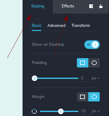
Example of sidebarTabs control:
Parameters
| Name | Type | Default | Description |
|---|---|---|---|
id | string | - | Unique identifier used to differentiate between individual sidebarTabs. |
type | string | - | Type should be "sidebarTabs" to use this control |
devices? | "all" | "desktop" | "responsive" | "all" | Define the devices where the control will be rendered. "all" renders the control on all devices. "desktop" renders the control only on desktop devices. "responsive" renders the control on both tablet and mobile devices |
disabled? | boolean | false | Configure the condition under which the control is disabled or enabled |
tabs? | Array<TabItems> | [ ] | An array defining the tabs within the sidebar. Each tab is represented by an object. TabItems: { id: string; title: string; label: string; position: number; options: ControlItems[]; } id - the unique identifier for each individual tab within the sidebarTabs title - the title displayed on the tab, representing the content section associated with that tab label - an additional label or description for the tab, providing further context or information about the content section it represents position - specifies the position of the tab within the sidebarTabs component options - an array of objects representing the content associated with each tab ControlItems: { id: string; title: string; label: string; position: number; type: string; } id - this property uniquely identifies each control item and is derived from a saved option value. It represents an identifier associated with a specific configuration or option selected title - the title displayed on the control, representing the content section associated with that TabItems label - an additional label or description for the control, providing further context or information about the content section it represents position - specifies the position of the control within the TabItems type - type of control |
Basic example
Standard definition with only the required keys. This control will be displayed on all devices.
{
  id: "tabs",
  type: "sidebarTabs"
}
Return value
The sidebarTabs control does not return anything.
Usage
Devices examples
It will be rendered on all devices. This value can be skipped because it is set to "all" by default.
{
  id: "tabs",
  type: "sidebarTabs",
  devices: "all"
}
Rendering will occur only on desktop.
{
  id: "tabs",
  type: "sidebarTabs",
  devices: "desktop"
}
The display is limited to responsive modes, specifically tablet and mobile.
{
  id: "tabs",
  type: "sidebarTabs",
  devices: "responsive"
}
Disabled examples
Control will be disabled. Normally, here should be your dynamic condition.
{
  id: "tabs",
  type: "sidebarTabs",
  disabled: true
}
Control will be disabled when videoType variable will be "custom".
getValue is a getter function that allows us to retrieve the value of controls by their id.
"videoType" is the id of the "select" control below.
const getToolbarContols = ({ getValue }) => {
  const videoType = getValue("videoType");

  return [
    {
      id: "videoType",
      type: "select",
      choices: [
        { title: "Youtube", value: "youtube" },
        { title: "Custom", value: "custom" }
      ]
    },
    {
      id: "tabs",
      type: "sidebarTabs",
      disabled: videoType === "custom"
    },
  ];
};
Tabs example
This configuration sets up tabs within a sidebar.
The tabs parameter includes control objects with nested elements such as id, title, label, and options.
{
  id: "tabs",
  type: "sidebarTabs",
  tabs: [
    {
      id: "moreSettingsAdvanced",
      label: "Advanced",
      options: [
        {
          id: "customCSS",
          label: "Custom CSS",
          type: "codeMirror",
          position: 45,
          display: "block",
          placeholder: "element CSS goes here"
        }
      ]
    },
    {
      id: "settingsStyling",
      label: "Basic",
      icon: "nc-styling",
      options: [
        {
          id: "padding",
          type: "padding",
          label: "Padding",
          disabled: true
        },
        {
          id: "border",
          type: "corners",
          label: "Corner",
          devices: "desktop",
          position: 65
        }
      ]
    }
  ]
}