Control Popover
Popover control is used to render other controls in popover. By itself, popover control is a button and does not return any value.
For popover control, the id property has no effect and is used only to separate from other popover's. Read more
UI example
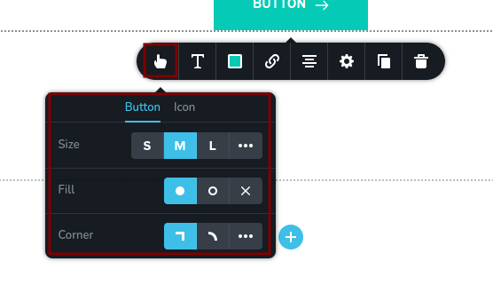
In the following example, the button in the first square represents the popover trigger. Clicking on it will open the popover itself with its controls (the second square).
Code example
The following example defines a popover with its controls, as described in UI example.
const getToolbarItems = ({ getValue }) => {
  const isCustomSize = getValue("size") === "custom";
  const isCustomBorderRadius = getValue("borderRadiusType") === "custom";

  return [
    {
      id: "buttonPopover",
      type: "popover",
      config: {
        icon: "nc-button",
        title: "Button"
      },
      options: [
        {
          id: "buttonTabs",
          type: "tabs",
          tabs: [
            {
              id: "buttonTab1",
              label: "Button",
              options: [
                {
                  id: "sizeGroup",
                  type: "group",
                  options: [
                    {
                      id: "size",
                      label: "Size",
                      type: "radioGroup",
                      choices: [
                        { value: "small", icon: "nc-small" },
                        { value: "medium", icon: "nc-medium" },
                        { value: "large", icon: "nc-large" },
                        { value: "custom", icon: "nc-more" }
                      ]
                    },
                    {
                      id: "width",
                      label: "Width",
                      type: "slider",
                      disabled: !isCustomSize,
                      config: {
                        min: 0,
                        max: 100,
                        units: [{ title: "px", value: "px" }]
                      }
                    },
                    {
                      id: "height",
                      label: "Height",
                      type: "slider",
                      disabled: !isCustomSize,
                      config: {
                        min: 0,
                        max: 100,
                        units: [{ title: "px", value: "px" }]
                      }
                    }
                  ]
                },
                {
                  id: "fillType",
                  label: "Fill",
                  type: "radioGroup",
                  choices: [
                    { value: "filled", icon: "nc-circle" },
                    { value: "outline", icon: "nc-outline" },
                    { value: "default", icon: "nc-close" }
                  ]
                },
                {
                  id: "borderRadiusTypeGroup",
                  type: "group",
                  options: [
                    {
                      id: "borderRadiusType",
                      label: "Corner",
                      type: "radioGroup",
                      choices: [
                        { value: "square", icon: "nc-corners-square" },
                        { value: "rounded", icon: "nc-corners-round" },
                        { value: "custom", icon: "nc-more" }
                      ]
                    },
                    {
                      id: "borderRadius",
                      type: "slider",
                      disabled: !isCustomBorderRadius,
                      config: {
                        min: 0,
                        max: 100,
                        units: [{ title: "px", value: "px" }]
                      }
                    }
                  ]
                }
              ]
            },
            {
              id: "buttonTab2",
              label: "Icon",
              options: []
            }
          ]
        }
      ]
    }
  ]
}